
Creating mobile-friendly website layouts is not rocket science, is it? Surprisingly, these 6 things get overlooked by designers very often. Looking for website templates with mobile-friendly design? Visit TemplateMonster Marketplace 👉 https://www.templatemonster.com/?utm_source=youtube&utm_medium=social&utm_campaign=tm_com
In this mobile-friendly website layout guide, we’re pointing out 6 OBVIOUS things you have to take care of when designing for mobile devices.
📌Jump to the timestamp:
00:21 Challenges for the designer of mobile-friendly website layouts
01:12 Use carousels to save space
01:24 Navigation
01:34 Search field
01:45 CTA
02:00 Font sizes
02:25 Buttons and Fields
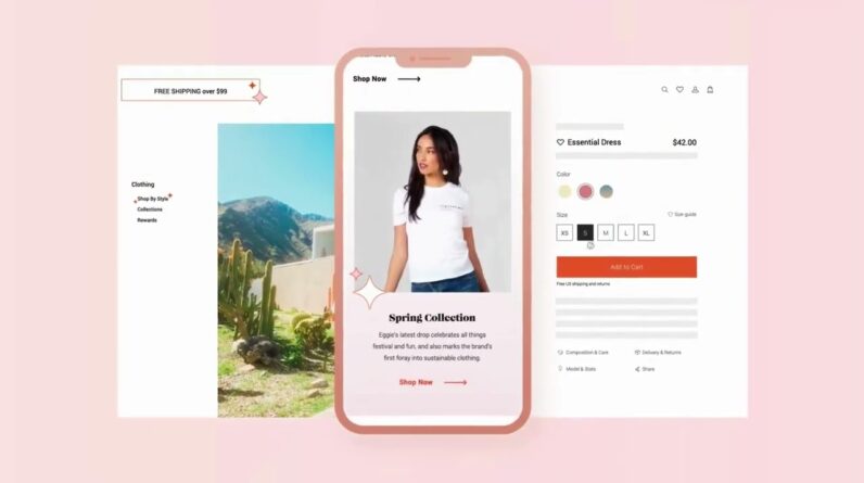
02:47 Mobile-friendly design for online stores
✔️Why Should You Watch This Video?
This video will be extremely useful for designers who want to create a mobile-friendly website. Why is it that important? According to statista.com – mobile devices accounted for 48% of web page views. The idea is simple – you need to have a mobile version of the website if you want to appeal to a larger audience.
This can be quite helpful if you just starting designing a mobile-friendly website. However, experienced designers will find this video useful too. Again, this video is focused on the main ideas that you can miss when you create a mobile-friendly website. This video is focused on some mobile-friendly design 2019 solutions, which can work in the future as well.
🔴This can be HELPFUL if you’re starting as a web designer:
Creating a mobile website design involves various aspects. This video can be considered to be the guideline that shows how you should approach various challenges. Of course, you shouldn’t ignore design trends as well. Therefore, your website should look amazing and it has to be ergonomic, so visitors can easily find what they need.
Please, keep in mind that this video includes the most important factors. Of course, creating a design is something special and there are many nuances to keep in mind. Nevertheless, this video includes some key concepts and points you need to keep in mind to create your mobile-friendly website amazing and provide visitors with the best possible user experience.
Sometimes, designers may miss certain ideas and concepts – the website still works well, but visitors can have some issues with it. Visitors may not find something they need or the website doesn’t show certain elements. When you create a mobile-friendly design you should not only test it on various devices, but you also need to get as much feedback as possible – consider asking people what they think of your website.
Sources:
https://www.statista.com/statistics/277125/share-of-website-traffic-coming-from-mobile-devices/
https://www.smashingmagazine.com/2018/06/reference-guide-typography-mobile-web-design/
#WebDesignInspiration #TemplateMonster #MobileFriendly
~~~~
Subscribe to our channel to learn more about web design: https://www.youtube.com/user/TemplateMonsterCo/
Follow us on social media:
🔖Facebook https://www.facebook.com/TemplateMonster/
🐦Twitter https://twitter.com/templatemonster
📷Instagram https://www.instagram.com/template_monster/
📎Pinterest https://www.pinterest.com/templatemonster/
🏀Dribble https://dribbble.com/TemplateMonster/
in LinkedIn https://www.linkedin.com/company/templatemonster/