
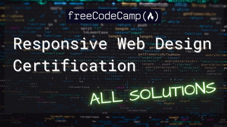
This stream walks through and provides all the solutions to freeCodeCamp Responsive Web Design Certification challenges.
0:00 Basic HTML and HTML5
8:50 Basic CSS
21:44 Applied Visual Design
40:53 Applied Accessibility
49:17 Responsive Web Design Principles
51:30 CSS Flexbox
56:33 CSS Grid
freeCodeCamp challenges:
https://www.freecodecamp.org/learn/responsive-web-design/
“Basic HTML and HTML5
HTML is a markup language that uses a special syntax or notation to describe the structure of a webpage to the browser. HTML elements usually have opening and closing tags that surround and give meaning to content. For example, different elements can describe text as a heading, paragraph, or list item.
In this course, you’ll build a cat photo app to learn some of the most common HTML elements — the building blocks of any webpage.
Basic CSS
CSS, or Cascading Style Sheets, tell the browser how to display the text and other content that you write in HTML. With CSS, you can control the color, font, size, spacing, and many other aspects of HTML elements.
Now that you’ve described the structure of your cat photo app, give it some style with CSS.
Applied Visual Design
Visual design is a combination of typography, color theory, graphics, animation, page layout, and more to help deliver your unique message.
In this course, you’ll learn how to apply these different elements of visual design to your webpages.
Applied Accessibility
In web development, accessibility refers to web content and a UI (user interface) that can be understood, navigated, and interacted with by a broad audience. This includes people with visual, auditory, mobility, or cognitive disabilities.
In this course, you’ll learn best practices for building webpages that are accessible to everyone.
Responsive Web Design Principles
There are many devices that can access the web, and they come in all shapes and sizes. Responsive web design is the practice of designing flexible websites that can respond to different screen sizes, orientations, and resolutions.
In this course, you’ll learn how to use CSS to make your webpages look good, no matter what device they’re viewed on.
CSS Flexbox
Flexbox is a powerful, well-supported layout method that was introduced with the latest version of CSS, CSS3. With flexbox, it’s easy to center elements on the page and create dynamic user interfaces that shrink and expand automatically.
In this course, you’ll learn the fundamentals of flexbox and dynamic layouts by building a Twitter card.