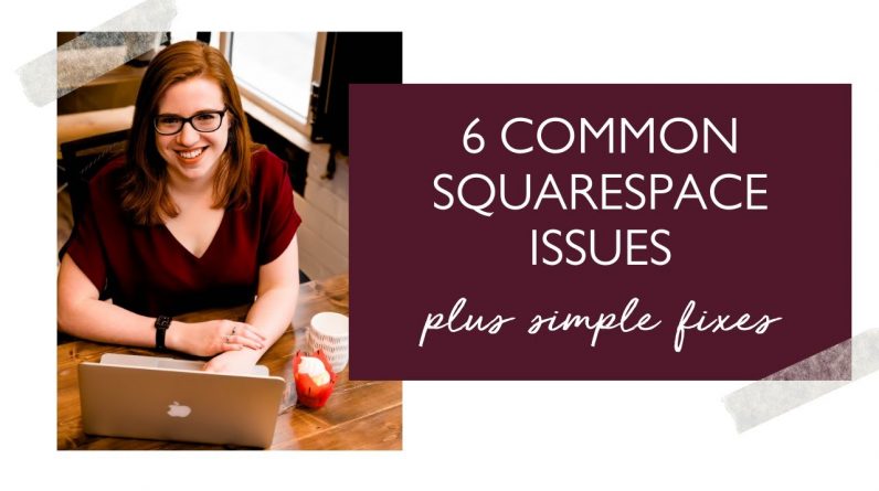
We all know that Squarespace is incredible for giving the power of website design to the average business owner. That said, the platform has a few limitations and a few things that consistently don’t look quite right without a little code.
So today I want to walk you through the things I change in nearly every single website I design.
Watch the video to see all 6 of these in action:
(0:00): Intro
(0:19): Image size on mobile
(1:48): Matching button sizes
(4:30): Ugly contact forms
(7:20): Embedding newsletter forms from Mailerlite/Flodesk/Convertkit/etc.
(10:18): Off brand & hard to read search bars
(15:06): No sidebar option for blogs/shops/podcasts
Get the code here: http://calibratedconcepts.com/blog/6-common-squarespace-issues-plus-simple-fixes


