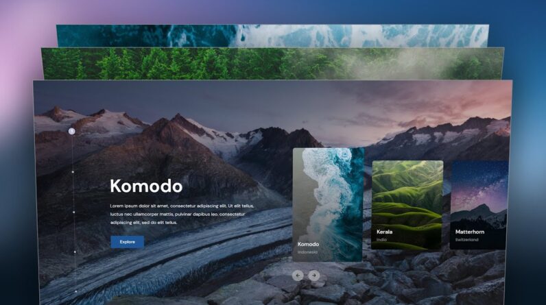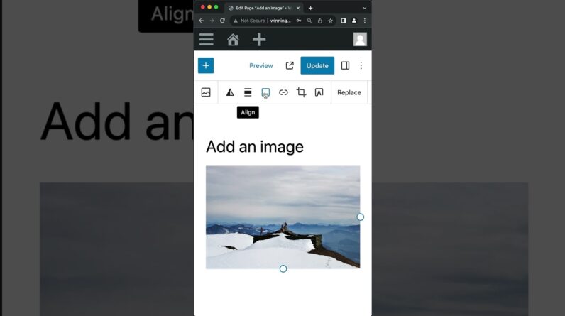
In this tutorial, I’ll show you how to make an Elementor Advanced Slider with Card Carousel. This video is about WordPress Custom Slider Design with Text and Image.
✅Get Elementor Pro:
https://makedreamwebsite.com/elementor-pro
✅Get code snippet for Advanced Slider:
✅Get this READY-MADE template on TEMPLATISH:
Today, I’ll show you how you can make an advanced card slider (full width) in your Elementor website. Here, on the right side there is a mini card carousel and when you change that carousel, everything is changing according to that: the background image, the content on the left side. On the very left you can see an indicator which are also perfectly working. The transitions are also so smooth, so when we go to forward we can see the forward animation and when we go to the previous slide we can also see the backward animation. This custom slider is also 100% responsive. It’s perfectly working on the tablet, mobile or any other devices.
If you want, you can get this advanced slider template from my template shop. Here also as a bonus, you’ll also get the non-container version of that. But, if you don’t want to get this advanced card carousel template, you can also start it from scratch.
First, we need to take a 2 column structure where on the left column we’ll take the indicator and the texts. Here, we’ve take some heading, text and button widget and design that.
Then, on the right side take an testimonial carousel widget and transform that into a custom card carousel. Under that, also take 2 arrows by using the button widget and make them functional.
With the text on the left, we have also added the changing effect. For that, we need to duplicate those content multiple times. Finally, we have also added the background images for each slide which is changing with our carousel change.
Lastly, we make it responsive for the tablet and mobile devices. And on mobile, we place the dots at the very bottom of the section.
So that’s how we can successfully created our Elementor advanced portfolio slider animation with text and image. If you enjoy this video, don’t forget to like and subscribe.


