
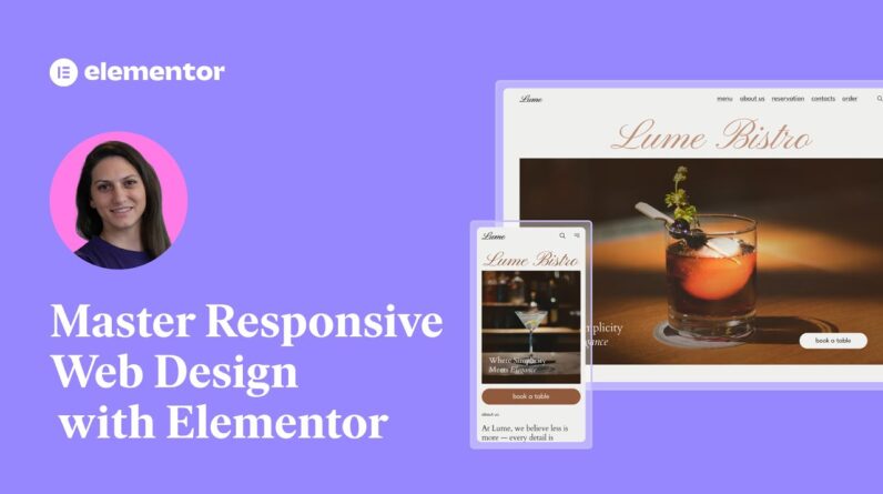
Want to make sure your website looks perfect on every screen? Whether it’s desktop, tablet, or mobile, responsive websites are key to providing a smooth user experience and boosting SEO performance.
In this video, we’ll walk you through the essential steps to mastering responsive web design with Elementor, so you can build websites that are beautiful, fast, and mobile-friendly from the start!
What You’ll Learn in This Video:
✅ Why responsive design is crucial for website performance & SEO
✅ How to use Elementor’s responsive-ready kits & templates
✅ The power of custom breakpoints & fluid layouts
✅ How to set scalable typography & flexible units (%, em, rem, vh, vw)
✅ Optimizing background images & interactive elements for mobile
✅ How to show/hide elements for different screen sizes
✅ Best practices for tap-friendly buttons & floating elements
🎯 By the end of this video, you’ll be able to create a fully responsive website using Elementor with ease!
Don’t forget to subscribe to our channel! 🔔
Get Elementor! 👉 https://elementor.com
Get Elementor Pro! 👉 https://elementor.com/pricing-plugin/
Get Image Optimizer! 👉 https://elementor.com/products/image-optimizer/
Join the Community 👉 https://www.facebook.com/groups/Elementors
Timestamps:
0:00 – Introduction
1:28 -Start Mobile-First with Elementor Kits & Template
1:52 – Mobile View & Additional Breakpoints
2:35 – Hierarchical Changes Across Breakpoints
2:58 – Responsive Units & Fluid Layouts
4:30 – Typography Units
5:26 – Optimizing Images for Devices
6:50 – Tappable Interactive Elements
8:00 – Outro.