


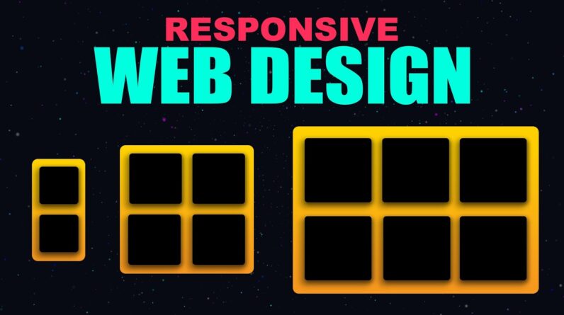
Learn responsive web design the easy way in this responsive web design tutorial! In this video, I’ll share 5 CSS tips and tricks to make your website look perfect on every screen — from mobile to desktop.
watch our video:
CSS Media Query – https://youtu.be/Q8meex0f3c8
CSS Units – https://youtu.be/8HkGwdUDOcc
CSS Flexbox – https://youtu.be/ZcyRtOK-e6c
CSS Grid – https://youtu.be/uE3YdHfkuxU
CSS Display – https://youtu.be/zI6DW1Sinqc
We’ll cover modern CSS techniques, CSS pro tips, and CSS tricks for responsive design including:
– min() function for flexible spacing
– clamp() for responsive font sizes
– dvh for better viewport height control
– aspect-ratio property for consistent images
– And other frontend tips and tricks for building responsive layouts without complex code.
This responsive CSS tutorial will help you create better, cleaner, and faster designs. Perfect for beginners and pros who want to master tips for responsive web design in 2025.
——————————
📌 Timeline:
00:00 – Intro to Responsive Web Design
00:31 – CSS Flexbox layout
01:00 – Powerful CSS Tips for Layouts
01:28 – Flex-grow, Flex-shrink & Flex-basis
03:03 – CSS Grid layout
04:50 – min() for Flexible Designs
05:16 – Responsive Font Sizes
05:58 – clamp() for Flexible Designs
06:49 – Responsive images
07:50 – aspect-ratio Property for Images
——————————
👍 If you found this video helpful, please Like, Share, and Subscribe for more CSS tips, tricks, and tutorials every week!