
A visitor hits your website and wants to talk to you. What does that person start searching for?
Your Contact Us page.
It’s a page on your site that pushes visitors from browser to buyer.
Contact Us pages are among the most underutilized and misunderstood resources on the web today.
Some companies don’t use them at all, and those that do have them often push these critical pages to the back burner during website revision projects.
That stops today.
I’ll share a step-by-step plan you can follow to strategize and revise this lowly web page. And I’ll use plenty of examples to spark your creativity.
Let’s get started.
What Is a Contact Us Page?
Think of a Contact Us page as a sort of digital business card. Sure, it’s short and concise. But if someone wants to reach out to you, they’ll use this page to do so.
Contact Us pages often get lumped in with other critical website resources, including:
- About Us pages: Use this resource to explain your company’s history, goals, and direction. If someone wants to know how you became a leader in your field, the data is ready to go.
- Help pages: Customers with critical product or service questions lean on this page to get their answers.
- Employment pages: Job seekers need private, protected spaces to learn more about open opportunities.
A Contact Us page is different because you’re telling people more about getting in touch with you.
Your page should also embody your brand and entice that click. If your Contact Us page is the blandest one on your website, you’re not alone. The best contact us pages contain some value proposition, even when they don’t have a lot of text.
Do You Need a Contact Us Page?
A Contact Us page can’t be skipped because it is a trust signal. Share location information and highlight your phone number and email, and you’ll demonstrate to wary consumers that they can reach you at any time.
Trust and transparency matter in marketing. Contact Us pages start the process.
Five Key Contact Us Page Elements
You know you need a Contact Us page. But you have no idea what to put on the page. Push past the writer’s block, and follow this recipe for success.
A converting Contact Us page contains these critical pieces:
- Your company name: Don’t beat around the bush. Use your full company name.
- Your physical address: This can get tricky for multi-location companies. Maps often solve the problem (and more on that in a minute). If you share only one address, use the one associated with your corporate headquarters.
- A map to your location: Google Maps hold immense power for marketers. When customers know where you are, even when they’re looking at a mobile device, your conversion rates can skyrocket. Boost that power by adding a Google Map to your Contact Us page.
- Your contact information: Include a phone number, email address, and a quick data-collection form. Customers need plenty of calls to action. Fight off spam with a CAPTCHA as well.
- Links to relevant pages: If you know customers have product questions, show them to your Help page. If you have plenty of job seekers, highlight that Jobs page.
Don’t be tempted to clutter up the page with more details and data. Keep things clean and streamlined with this list.
Build the Perfect Contact Us Form
If you’re looking for a way to streamline customer conversations, forms are key. If you build forms correctly, routing questions is a snap.
Your form could include several fields, including:
- Name
- Location
- Current customer (Y/N)
- Question
- Email address
- Phone number
You might be tempted to add all of these fields to your form. The more data you have, the better, right?
Not always.
When customers face a sea of questions, they tend to click away. Form completion rates and added fields are inversely related.
To keep those conversion rates up and deliver exceptional user experience, only ask critical questions.
10 Exceptional Contact Us Page Examples
I’ve talked a lot about what should and shouldn’t go on a Contact Us page.
These ten companies have lessons anyone can apply.
Streamlined and Simple: Scorpion
Scorpion offers internet marketing services to law firms, hospitals, franchises, and more. The company shows off robust design skills on all other web pages. But this one is remarkable in its simplicity.
Customers answer one simple question with a dropdown. The answer routes them to an appropriate secondary form.
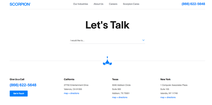
Customers can also skip the hassle of forms altogether, call the number in the top-right corner of the screen, or visit one of three locations listed at the bottom of the page.
Brand Promise First: BarkBox
A subscription service for happy dogs should have a dog’s photo on a Contact Us page. And that dog should look happy. BarkBox has that element covered.
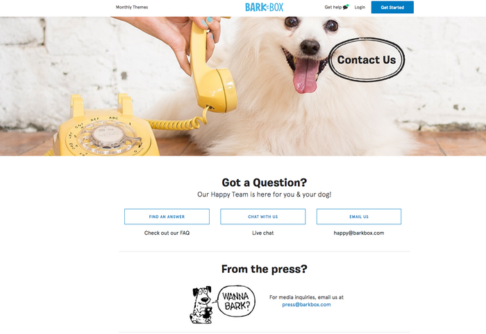
Customers have three different contact options sitting below that big image. They can search FAQs, start a live chat, or send an email. It’s a simple, streamlined interface made for busy dog lovers.
Personality Plus: Kick Point
This Canadian marketing firm kicks off the About Us page with a chatty, conversational tone.
Keep scrolling, and that clever voice keeps speaking. When you reach the bottom of this page, you know just how these employees talk and write.
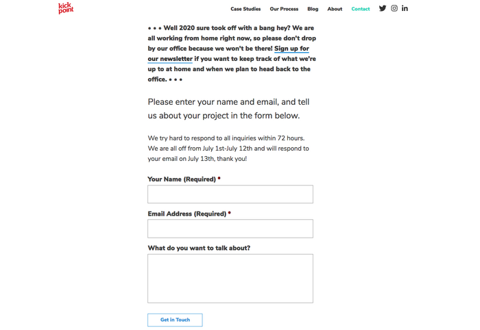
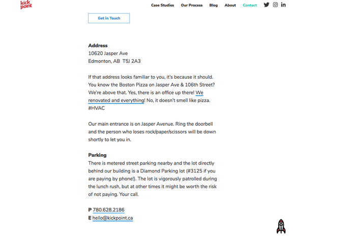
The cleverness doesn’t impede clear communication. You’re told the company’s address, email address, phone number, and more.
Crisis Communication: Powell’s Books
Powell’s puts customer communication front and center on this Contact Us page. Timely content about shipping delays comes first. Keep scrolling, and you’re taken to email addresses and phone numbers.
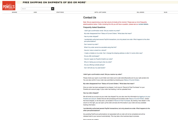
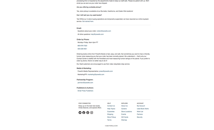
Typically, converting Contact Us pages are short. But you can break the rules when the unexpected happens.
Arresting Graphics: Parker Lee
People hire Parker Lee to design logos, websites, and other branded elements. He puts those skills to work on this visually arresting Contact Us page. The page begins with a brand statement, but scrolling past that is a snap.
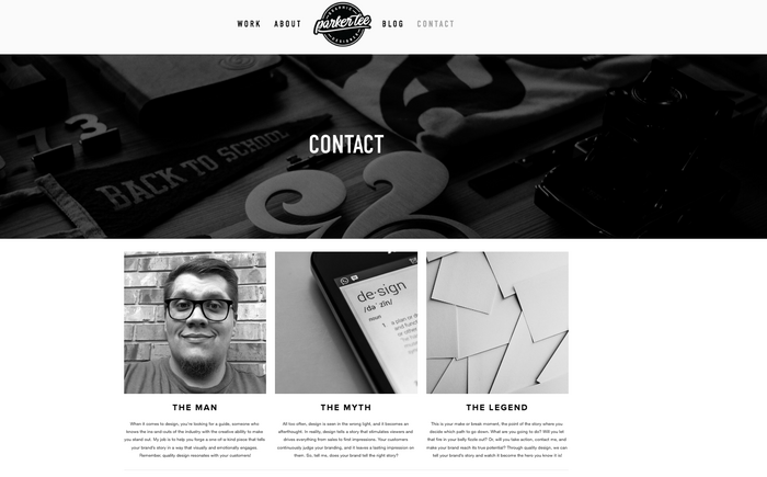
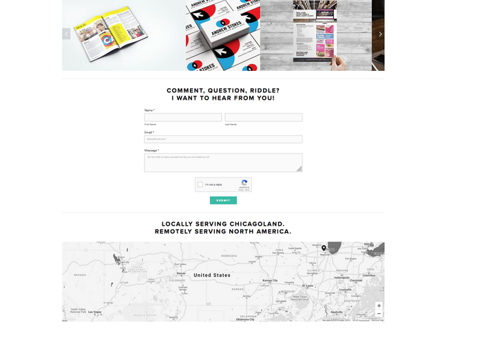
A simple form with just four fields appears, and a clever map rounds out the page.
Forms Do the Hard Work: Six Leaf Design
This company emphasizes sales on this Contact Us page. A three-field form, with a tiny multiple-choice quiz, gets potential customers a price quote.
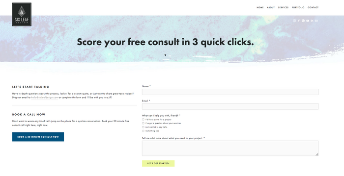
A blue button for anxious customers leads right to a 20-minute consult appointment. For companies hoping to emphasize lead generation, this is a smart model to follow.
Friendly Faces: Byte
Who will customers talk to when they reach out? Byte answers this question with photos of real-life customer service reps ready to respond to questions.
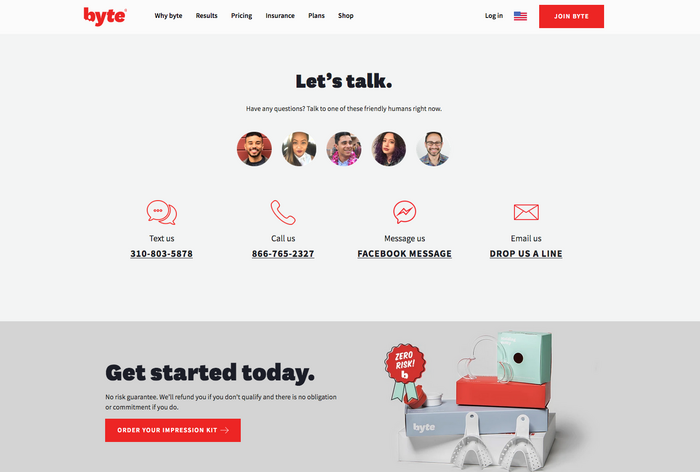
Choose from multiple contact formats, including text, email, Facebook message, and email. All of this data is streamlined, so white space surrounds the page.
Product Photography: Freshly
Freshly offers meal-kit delivery services, and an enticing product takes up about half of this Contact Us page. Putting the product first could attract customers to jump into a purchase.
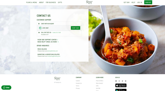
The contact box is the clever bit. Customers can chat, call, text, or skip to email.
This is a simple, friendly interface that puts the product first.
Multi-Location Mastery: Wendy’s
How do you handle inquiries when customers have dozens of locations to choose from? Wendy’s handles this question with a “Find Wendy’s” button at the top of the page.
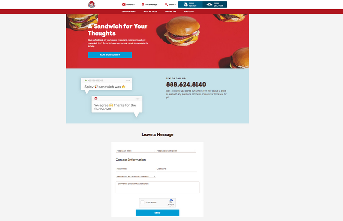
Customers with questions can text or call a number displayed in big, black text. It’s nearly impossible to miss. A clever, short form rounds out the page.
Short and Sweet: My Own
I put best practices to use on my website’s Contact Us page. I use a drop-down to route questions, and I ask customers to fill out just three fields.
I keep the branding light on this page, but the colors remind my guests that they’re still on my site.
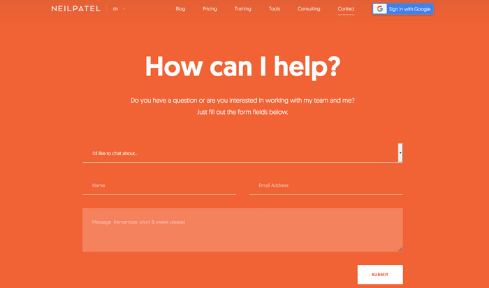
I also link to relevant social media sites to follow me through those platforms. My digital marketing consulting contact form is similar. Short and sweet with just the information I need to know.
Contact Us Page Do’s and Don’ts
We’ve walked through several examples of pages that convert. And we’ve shared quite a few tips you can put to use right now.
But there’s more to learn.
As you’re working on your Contact Us page, be sure to:
- Be a good journalist. Put the important stuff first. Your visitors are there to connect with you. Make those opportunities easy to find and deliver an exceptional user experience. Save the rest for last.
- Promote your page like a pro. Put a link to your page in your email signature and link it to your social media accounts. Make sure customers know you’re interested in a connection.
- Link to your page. Customers look in the top-right corner of a page for Contact Us links. Make sure each page on your site connects to that critical page.
Before you publish your Contact Us page, be sure to avoid:
- Cluttered design. Don’t fill the space with tons of graphics, jokes, or text blocks. Respect what your consumers are there to do – contact you.
- Overconfidence. Use A/B testing to find the design your customers want. Don’t be overconfident about your design prowess — you might be surprised by what works!
- A desktop-first mentality. Test your site on mobile devices. Try out the form fields. Plenty of customers will visit you on the go; make sure their experience is a good one.
It takes time to design a Contact Us page that converts. Don’t be afraid to slow down, test, and head back to the drawing board. You can’t afford to make mistakes on such an essential piece of your website.
Conclusion
Your Contact Us page is one of the most critical assets on your website. People head here when they want to reach you. Make that communication as quick and painless as possible.
Publish with confidence, and watch those conversion rates. If you don’t see the response you want, change it!
With experimentation and vigilance, you can develop the right Contact Us page that works for your customers, your company, and your community.
Is your current Contact Us page lacking? What can you change to make it more effective?
The post Contact Us Page Tips: Move From Blah to Yeah! appeared first on Neil Patel.


