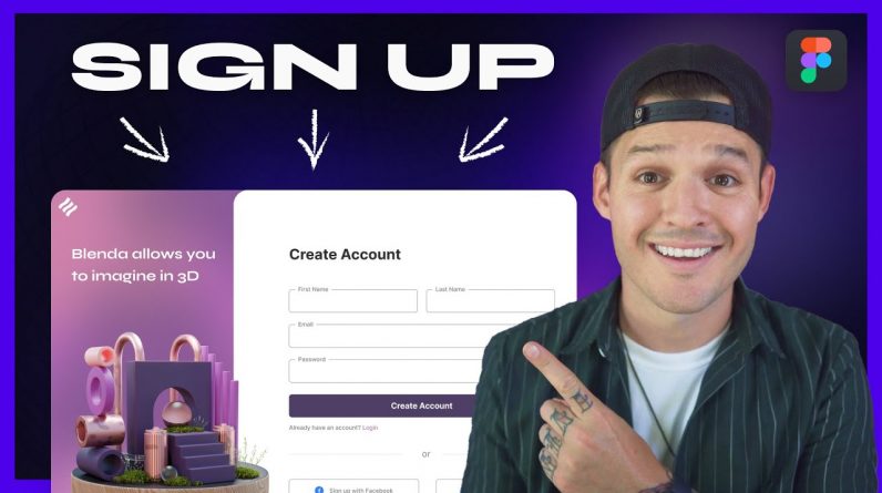
If you’re looking to design a sign-up page for a website, then this web design tutorial is perfect for you. In this tutorial, we cover everything you need to know about designing a signup page that is both visually appealing and user-friendly… Remember to Subscribe https://goo.gl/6vCw64
We start by discussing the importance of a clean and simple design for your sign-up page, as cluttered designs can discourage users from signing up. We then move on to the various design elements that make up an effective signup page, including the use of clear and concise copy, appropriate color schemes, and easy-to-use form fields.
By the end of this tutorial, you’ll have all the knowledge you need to create a visually appealing and user-friendly sign-up page that encourages users to sign up and engage with your website.
So, whether you’re a seasoned web designer looking to improve your skills or a beginner just starting out, this tutorial is a must-watch. Check it out now and start designing your own sign-up page today!
🏆 //////////// Join my members community to get access to perks:
You can get this starting and ending design file
https://learn.jesseshowalter.com/members
————————————————————————————
🤝 //////////// My Courses, Templates, Free E-Books, & 1:1 Mentorship
https://learn.jesseshowalter.com/
👋 ////////// Follow me on Social
Instagram: https://www.instagram.com/iamjesseshow
Twitter: http://twitter.com/iamjesseshow
📫 ////////// Sign up for my Monthly Newsletter
www.jesseshowalter.com/newsletter
————————————————————————————
🖥️ ////////// I build most of my websites using Webflow
https://webflow.grsm.io/1976712
🎵 ////////// Take your films to the next level with music from Musicbed. Sign up for a free account to listen for yourself: https://fm.pxf.io/c/1372011/1347628/16252
📸 ////////// The Equipment I use
https://www.amazon.com/shop/jesseshowaltertv


