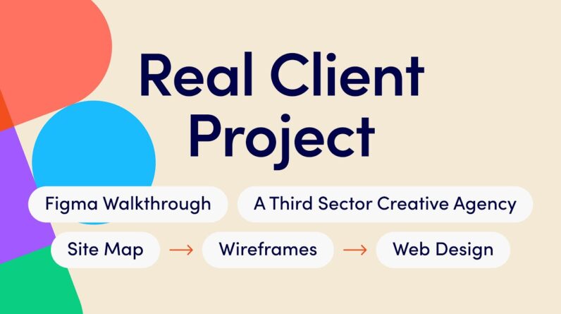
Figma website design walkthrough for you showing you what it looks like inside a real client project at Tonic.
We show an overview of the live website and walk around our Figma file so you can see how the project was built, some mistakes, some bad designs, the style guide, and what the final signed-off designs look like.
Timestamps:
00:00 Intro and overview
00:43 Overview of pages and look at the site map
03:25 Wireframes
08:34 Style guide
11:00 Design direction
12:30 Finished design
20:12 Live website home page
21:20 Outro
Visit the live website here – https://catsnake.com/
Want us to build you a website? Book an intro call here – https://calendar.app.google/D5v5wx6be19BT5am6
Try Webflow with our affilliate link – https://webflow.grsm.io/4838125
Intro music:
Lofi Study by FASSounds on Pixabay
Outro music:
Illusions – Anno Domini Beats from YouTube Music
Connect with us:
https://www.wearetonic.uk/
https://www.instagram.com/wearestudio…
https://www.linkedin.com/company/83074405/


