
Just getting started with Squarespace CSS? Awesome! 😍 I want to teach you the basics – grab my free Getting Started Guide here 👉 https://insidethesquare.co/learn
—
🥳 Ready to launch ? Use the code PARTNER10 for 10% off (affiliate code): https://insidethesquare.co/partner10
—
💕 Love this free Square space tutorial? You can donate via Paypal to help support my YouTube Channel https://www.paypal.com/paypalme/insidethesquare
—
This tutorial is for both versions of Squarespace. It works for Squarespace 7 sites, like Brine, Bedford & Pacific, and this tutorial is for Squarespace 7.1 which is used in the demo. In both versions, to edit your custom code, start at your main menu and navigate to Design and then to Custom CSS. To install CSS on a single page in your Squarespace site, check out this tutorial for Squarespace 7: https://www.youtube.com/watch?v=ptQkzTVYRFs
—
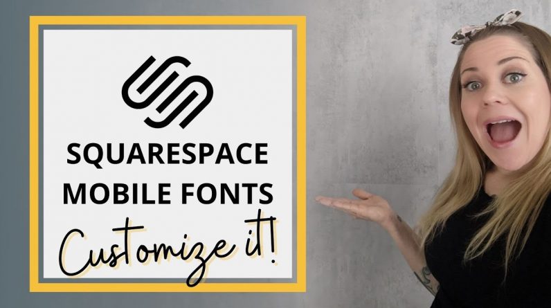
In this tutorial, we are getting into some more mobile magic, talking specifically about how to change the size of your mobile fonts. Now I do have a basic tutorial on this from last year but there are some nuances I did not cover in that version that I want to make sure you know, especially if you are working with 7.1
Now we can specify by mobile screen size based on breakpoints using what is called a media query. If you missed that tutorial, I have a link to it here(https://www.youtube.com/watch?v=-ZsTIoZwhpQ) and you can visit https://insidethesquare.co/mobile to grab the free cheat sheet so you can follow along.
Using a media query you can say “hey browser, only do this code thing when the screen size is this big” So for text, you can call out individual text types by their code names and say “hey browser, on any screen that is this size or smaller, make my paragraph text this size.”
@media only screen and (max-width: 640px){ p{font-size:1rem!important} }
But we can get even more specific than that! A great example is your footer text. Let’s say your footer has some paragraph text, and you like the size of it for your blog post here, but your footer links look waaaay to tiny and you want only those to change. You can say “for screens this size, when you load the footer, if there is any paragraph text in there, make sure it shows up as this size.”
@media only screen and (max-width: 640px){#footer-sections p{font-size:1rem!important} }
So you can see the text on the rest of your site is exactly the same, but the text on your footer is different. You can do this for page sections in 7.1 too, or any really any block of text when you use its block id.
Now what about active links, like in the video? Add the “a” after the paragraph text “p” to say only footer paragraph text active links like this:
@media only screen and (max-width: 640px){#footer-sections p a{font-size:1rem!important} }
Also, if for some reason you aren’t seeing anything happening, you can always add the text exclamation point important (!important) to make sure that the browser prioritizes your code over the main site styles file that Squarespace generates for you.
Okay, that’s it for this tutorial. Grab that breakpoint guide at https://insidthesquare.co/mobile but most importantly, have fun with your Squarespace website. Thanks for watching and I’ll be back with another tutorial next Tuesday! Be sure to subscribe so you don’t miss it ♥
▸▸▸ Ready for more codes?
The codes in this tutorial are just the beginning of all the cool things you can do with Custom CSS! When you’re ready to dive in and start customizing, you can use codes from my CSS Cheat Sheet. It has over 30 pages of code snippets and pro tips to help you get started. Download your copy at https://InsideTheSquare.co/css
—
The term “Squarespace” is a trademark of Squarespace, Inc. This content is not affiliated with Squarespace, Inc. I just really love their platform ♥
—
#squarespace #squarespacecss #howto #customizesquarespace #css #squarespacetricks #squarespacehacks #anchorlinks #squarespacetips