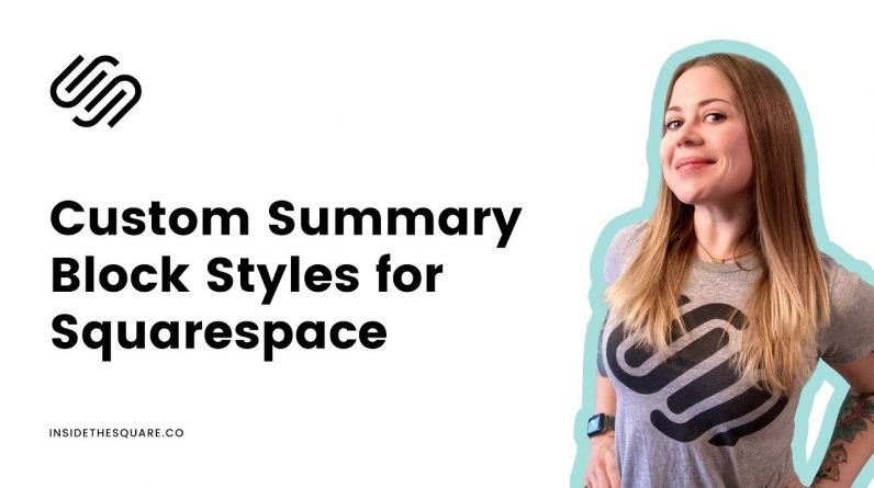
As great as the summary block feature is, the built in design can be pretty…well, boring! In this tutorial, we’re going to check out the selectors behind these summary blocks and use some custom code to make them look awesome.
—
This is just the start of all the cool things you can do with custom CSS! Learn the basics in my free class: https://insidethesquare.co/learn
—
Here are the selectors from this tutorial. You can use these selectors with property & value codes to make your site look unique! Consider trying borders, background color, box shadows, and any other combination of properties and values you want to customize.
.summary-block-wrapper
.summary-item
.summary-thumbnail
.summary-content
.summary-title
.summary-excerpt
.summary-metadata
.summary-read-more-link
– – –
💸 GET 10% OFF YOUR FIRST YEAR OF SQUARESPACE 💸
Use my affiliate link and code PARTNER10 – You’ll save 10% off your first annual subscription & Squarespace will give me a little commission for sending you their way 😎
🔗 PARTNER10 → https://insidethesquare.co/partner10
– – –
🤩 Download over 60+ pages of custom codes and pro tips for customizing Squarespace in one awesome PDF. Order the Squarespace CSS Cheat Sheet, available now at 👉 https://insidethesquare.co/css
—
🙋 Need some help? Visit https://insidethesquare.co/code-help to see my current support options.
—
🥰 SUPPORT MY CHANNEL → https://paypal.me/insidethesquare
💻 WEBSITE → https://insidethesquare.co
📧 NEWSLETTER → https://insidethesquare.co/email
🤳 INSTAGRAM → https://www.instagram.com/thinkinsidethesquare
👍 FACEBOOK → https://business.facebook.com/insidethesquare
📌 PINTEREST → https://www.pinterest.com/insidethesquare
—
The term “Squarespace” is a trademark of Squarespace, Inc. This video was not approved or endorsed by Squarespace, Inc. I just really love their platform ♥


