




Key Takeaways
- Forms tend to underperform because they’re built for a general audience. Know who you’re targeting and create forms that match where they are on the funnel.
- Multi-step forms, conditional logic, and autofill make longer forms feel shorter.
- A benefit-led call-to-action (CTA) and a one-line privacy note can help reduce hesitation to submit a form.
- Continue testing fields to see if they’re driving outcomes. That might include removing fields that aren’t leading to conversions.
The forms on your website are full of opportunity. Unfortunately, not everyone gets forms right, and they don’t convert the way they should.
Simply putting a form on a landing page doesn’t guarantee people will submit.
One study showed that more than half of people who visit a form fail to successfully complete it. Since forms are a gateway to lead generation, that’s a lot of missed opportunity.
Why aren’t people clicking or completing?
If you don’t optimize your forms for users, they’re more likely to abandon them or not even click into them at all.
So, how do you increase form conversions?
A few tweaks like form placement, field count, color, and copy can turn your forms into a key driver of lead generation, which is exactly what this article will cover. Read on to start generating the leads you need to scale and grow.
1. Place the Form Where It Gets Seen
Form placement dictates how many visitors see your form. Attention still clusters at the top of the page, where users spend more time. That said, placement should shift based on factors like user intent and what you’re asking visitors to commit to.
Industry plays a role, too. B2B brands, for example, typically see higher average time spent on page than retail brands.
Why?
Higher-intent users, like those shopping for a specific product at a store, tend to convert better on shorter pages. They know what they want (and they want it fast). A call-to-action (CTA) or form makes sense at the very top of the page, or even as a pop-up.
Gap.com, for instance, uses a pop-up to capture user attention with a 15 percent-off discount.
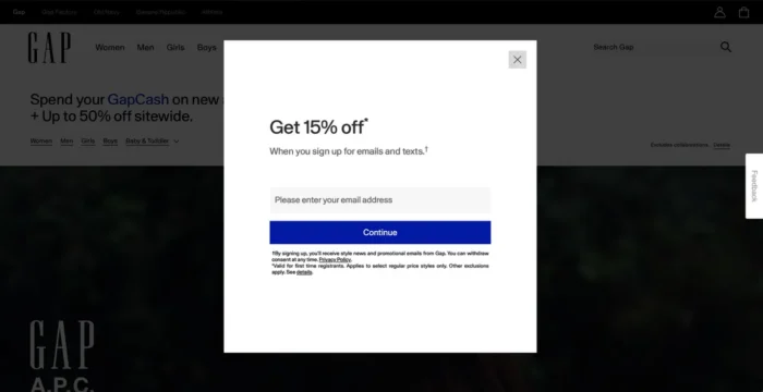
Saving money doesn’t need much explanation, so it makes sense to put this front and center.
Lower-intent users want more information before making a decision, especially for complex products or services, such as booking a software demo. They need to understand what you do and why it matters to them.
Deel pulls this off well. It offers enterprise cybersecurity tools and wants users to book a demo to learn more. This page asks a few questions about what the user wants before the link to book.
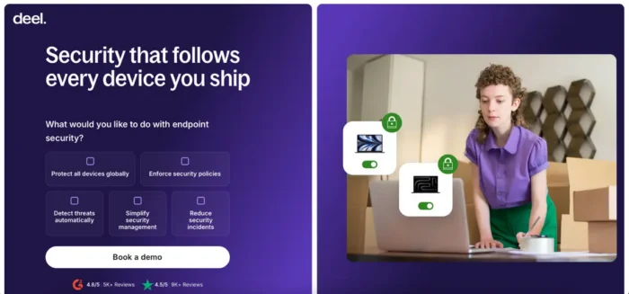
Users get a clear view of what Deel does and can consider their services before booking a demo.
Device type also matters because the fold moves by device. According to StatCounter, the most common desktop resolution is 1920×1080 (28.1 percent). Top mobile screen resolutions include 414×896 (13.3 percent) and 360×800 (7.6 percent).
A smaller device like a phone could push the form down below other elements like the header or hero image, and users may never even see it.
2. Ensure You Have a Strong Call-to-Action
The call-to-action is the tipping point between conversions and bounce. It drives action and conversions, which is what you want.
Not all CTAs do the job well, however. Something as simple as a word or color can affect conversion rates.
For example, a button that says “Submit” asks for effort without a clear value proposition.
Instead, use benefit-driven copy like “Get My Free Guide” or “Start My Free Trial.” Share the value on the other side of the click, even if it takes a few words.
A longer CTA that names the benefit beats a short one that names nothing.
Some studies show that changing the copy on a CTA can increase leads. It’s worth adding a few words to clarify value.
The Ordinary uses copy that clearly directs users to customize their shopping experience with a “Build My Regimen” button at the top of the page. The use of first-person language (“my”) personalizes the action and empowers the user.
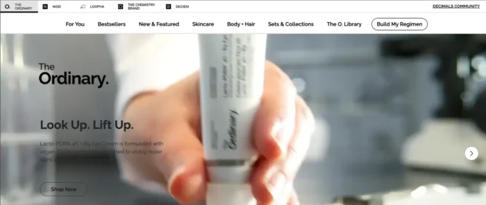
What happens after they click is equally important. If the user doesn’t get a clear confirmation or direction of what to do next, retention and engagement may decrease.
Finally, A/B test. Testing different variations of your CTAs will give you clear data about what’s working and what’s not.
3. Show You’ll Protect Their Information
Privacy is an important part of your strategy for how to increase form conversions. Users don’t want to hand over personal information to something or someone they don’t trust.
Protecting users’ privacy also matters to regulatory bodies, which require a privacy statement and explicit consent mechanisms in many contexts.
The General Data Protection Regulation (GDPR) covers any organization that targets or collects data about people in the European Union (EU). Consent must be “freely given, specific, informed and unambiguous.” In practice, that might mean adding an unchecked opt-in box that users must check to receive your emails.
The California Consumer Privacy Act (CCPA) requires covered businesses to explain what personal information they collect and why. Other regions have similar laws.
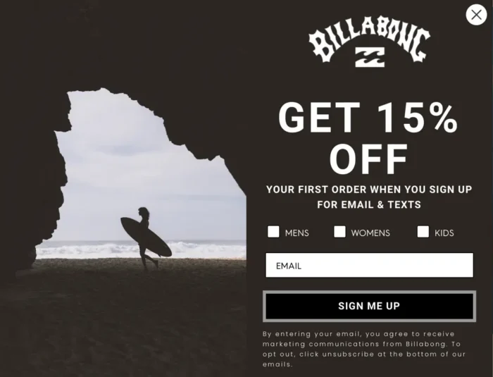
Keep your reassurance simple. Put one plain line under the button, such as: “We never sell your information. Unsubscribe anytime.”
Billabong models this well. Its signup pop-up states clearly what visitors are signing up for and how to opt out, right in the same window.
4. Remove Everything That Gets in the Way
Friction is anything on the page that slows users down or gives them a reason to leave your form.
If a lot is going on around the form, it can distract them. They may get distracted, annoyed, or abandon the form altogether. Having fewer form fields is one fix, but there are several other ways to create a form that converts without resistance.
Use White Space and Clean Design
White space allows for scannability and readability. It gives the eye a place to rest and draws attention straight to your form and your CTA.
A crowded page makes visitors work harder to find where to click.
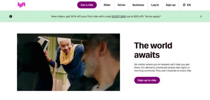
Lyft’s homepage shows how calm a form can feel. White background, black text, one bright purple button. There’s no question about where to click. Borrow that focus for your own form.
Make Non-Essential Fields Optional
I’ve learned from personal experience that a long signup form creates a lot of friction.
Make some form fields optional to show users that they’re not obligated to fill out everything.
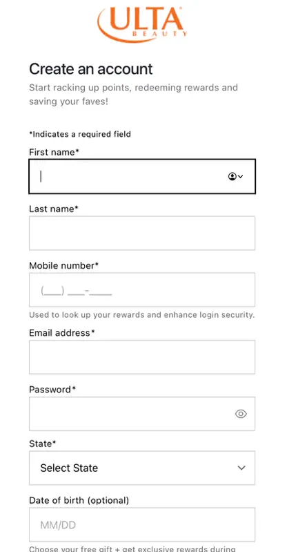
Most signup form builders allow you to have the word “optional” inside the form. For example, you might require a name and email but leave the phone number field optional. Ulta Beauty does this well, clearly marking required fields with asterisks. The word “optional” sits next to the fields users can opt to skip.
Use a Multi-Step Form
Multi-step forms can perform better when they align with the user’s expectations. Think of someone requesting a quote for a service or booking a demo. They’re high-intent. They clicked because they expect something valuable on the other side.
The structure works in your favor. The first step, usually just an email address, has the least friction.
Once a user completes that step, they feel invested. The deeper they get, the more likely they are to complete the form.
On The Farmer’s Dog website, users enter information in a multi-step form to receive a dog food plan:
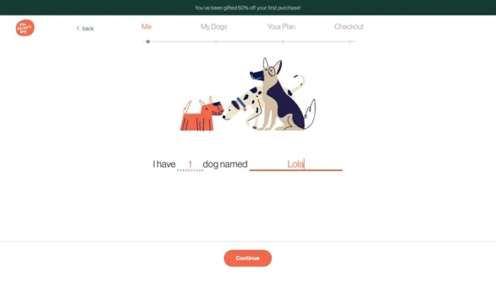
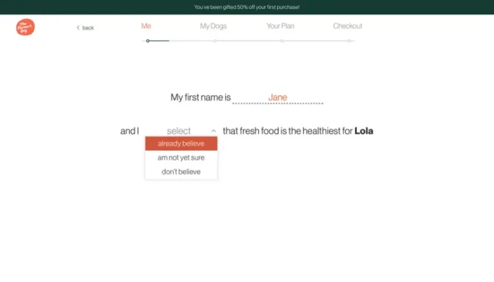
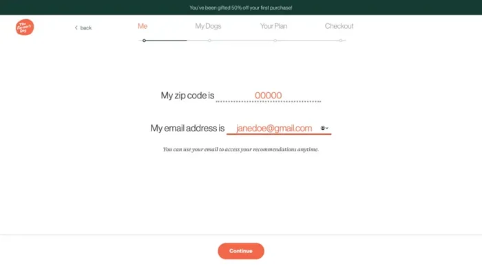
Each step asks for one or two pieces of information, so no single screen feels overwhelming. By the time users reach the end, they’ve already invested a few minutes personalizing their plan and have a reason to see it through.
Enable Autofill, Pre-Population, and AI Form Shortening
Typing out my email in forms can get annoying, and your users probably feel the same way. Here are three ways to reduce friction:
- Browser autofill: Code your fields with the right autocomplete attribute values. Browsers and password managers can then pre-fill the name, email, address, and phone number.
- Social login: LinkedIn’s sign-in can return a member’s name and email. Google lets you pre-populate new accounts with consensually shared data from a profile.
- AI-powered form shortening: platforms like HubSpot have enrichment-based form shortening. Users see a shorter form, and hidden fields are filled using third-party data. Your customer relationship management (CRM) platform still receives the user’s complete record.
Use Inline Validation
Inline validation flags errors as visitors fill out the form, not after they click submit. When a field is incorrectly formatted, a red border appears around it immediately so the user can fix it in the moment.
Why does this matter?
Paired with clear copy, inline validation prevents user frustration after completing an entire form only to find something was wrong. Less frustration can lead to more complete forms, which means more leads for you.
Sync the Form with the Surrounding Page
Your text, images, and form should feel like one conversation, not three competing voices.
If you have a product image, make sure that it doesn’t overlap with the form and call-to-action.
Match the message, too. If an ad promises a free guide, the headline above the form should say, “Free Guide.”
If a user clicks an ad for a free guide but lands somewhere else, they may bounce. The form should confirm they’re in the right place with consistent copy that matches the offer.
5. Use Fewer Fields (or Smarter Ones)
Each field on a form is a small ask, so the more you add, the more overwhelmed a user may feel.
Instead, ask only for what you need to qualify the lead and start the relationship, which means fewer form fields.
NP Digital’s data on the impact that the number of form fields has on conversion rates is telling: One-field forms converted at 18.2 percent. Add a second field, and conversion drops to 13 percent. By nine or more fields, it’s down to 4.2 percent.
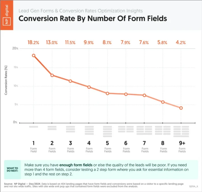
More fields can mean fewer leads, so it’s typically best to cut any forms that create friction between the user and completion.
Ask yourself what you truly need before the first conversation. Usually, that’s a name, an email, and maybe one qualifying question. Save the rest for later, once you’ve nurtured the relationship.
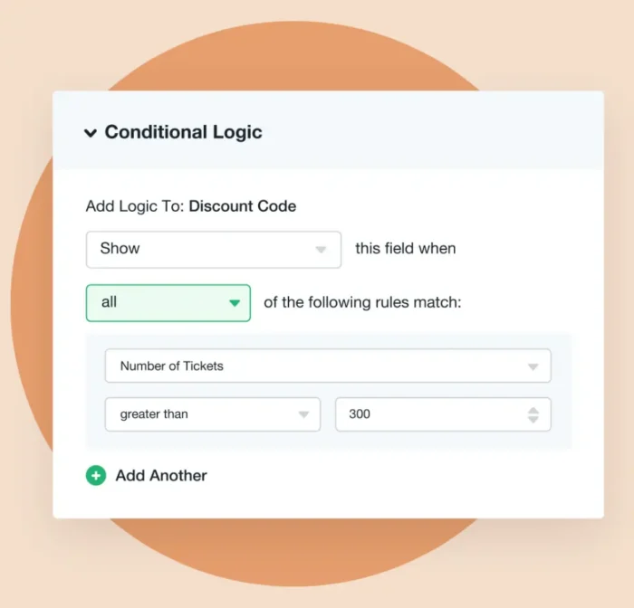
When you do need more than a few fields, conditional logic can keep the form from feeling overwhelming. It hides fields based on a visitor’s answers, so users only see questions that apply to them. HubSpot describes conditional logic as a feature that “dynamically updates your form based on a visitor’s real-time responses.”
The form looks shorter, so users are more likely to complete it.
Use Conditional Logic to Show Only Relevant Fields
So, when does conditional logic make sense? Smart forms use it to show or hide fields based on a visitor’s previous answers.
Say someone picks “Small Business” as their company type. The form can skip the enterprise questions and show only the fields that fit their business type.
Users will see a shorter form, but you still collect data from all respondents.
Major platforms like Typeform, Formstack, HubSpot Forms, and Jotform support conditional logic natively.
6. Test Your Form Placement and Design
A form isn’t finished the day you publish it. Keep testing placement, design, and copy to see what version performs best. Here are a few tips for testing forms:
- What to test: Test form placement above the fold vs. lower on the page, copy, number of fields, button color, field order, and overall form length.
- How to structure the test: Make one change at a time, and run the test until it reaches a statistically significant sample.
- Pick a tool: Optimizely and VWO both run A/B tests. HubSpot and Unbounce build testing into their own form and landing page tools. Google Optimize is no longer the best option for form testing.
7. Match Your Form and CTA to the Landing Page Promise
Message match is how closely your landing page’s copy, design, and offer align with the ad, email, or link that brought the user there. Points to remember:
- Pull keywords from your headline into the CTA button: “Free SEO Audit Checklist” deserves “Get My Free SEO Checklist,” not just “Submit.” Optimize landing page conversion rate lead forms with a few simple words.
- Message match affects Google’s Quality Score: Google’s Ad Rank weighs the usefulness and relevance of your ad and landing page, and higher-quality ads can often lead to lower cost-per-click (CPC). A mismatched page can cost you.
8. Place Social Proof Next to the Form
A trust signal is any proof of credibility that isn’t your own sales copy, such as a testimonial or compliance badge.
Placed right next to your forms, these signals reduce hesitation at the exact moment a visitor is deciding whether to submit the form.
A few trust signals that work well:
- Client logos and review counts: Put a row of recognizable client logos or a “Join 10,000+ marketers” count next to the form. This answers the question “Is this trustworthy?” before visitors even ask.
- Specific testimonials: A short, outcome-focused quote from a real client outperforms a simple five-star rating. Quotes like “I booked three new clients in my first month” make the result real. Put it inside the form’s visual field, not in a testimonial section farther down the page.
- Security and compliance badges: Secure Sockets Layer (SSL), System and Organization Controls 2 (SOC 2), and GDPR compliance address the question “What happens to my data after I submit this?” Put badges like this near the bottom of the page, but not in the footer.
9. Optimize What Happens After the Submit
Users are at peak engagement right after they hit submit. A generic page that says, “Thank you. We’ll be in touch,” stops that momentum instead of building on it, wasting a prime opportunity to nurture the relationship.
Here are three ways to capitalize on the moment they submit:
- Book a meeting immediately: For high-intent forms, send the confirmation page straight to a calendar (Calendly, HubSpot Meetings). Skip the back-and-forth email and instead get them to book a call before they change their mind.
- Deliver value immediately: The confirmation page should offer helpful resources like an eBook, guide, or webinar. This rewards the user for submitting the form and gives something of value that made the form worth it. Don’t make the user wait for a follow-up email they might not open.
- Guide the next step: Give the user a clear action even if you don’t have an offer or resources. Point them to a related blog post. Ask them to follow you on social media. Link to a product demo. Just saying “Thank you” leaves users with nowhere to go and no reason to stick around.
A Note on Mobile: Your Form Must Work on Any Screen
Mobile devices drive 59.1 percent of worldwide web traffic, according to StatCounter. With most visitors browsing on a phone, your forms need to work on a small screen first.
Remember these four tips when designing forms for mobile:
- Responsive fields: Make fields big enough to tap without a second try.
- Matching keyboards: An email field should open the email keyboard, while a phone field should pull up the numeric keypad.
- Multi-step layouts: Breaking a long form across multiple screens keeps each step short and manageable.
- Load time: A slow page loses mobile visitors before they ever see your form.
FAQs
Which fields are most likely to block completions, and which can I safely remove?
Phone number, company size, and address ask for the most effort and trust from users, which could make them drop-off points. If your sales team isn’t actively using a field in early conversations, cut it.
How much uplift should I expect after testing a shorter form?
Expect a range of results. NP Digital data shows conversion falling from 18.2 percent at one field to 4.2 percent at nine or more. Your own testing will tell you your number.
What analytics events and funnels reveal where people drop out of my form?
Track form view, first field focus, each field’s completion, error messages, and submissions to show where users drop off. Build a funnel from those events in Google Analytics 4 (GA4) to track and prevent users from dropping.
Will converting a long form into multiple steps improve completions?
A multi-step form may improve conversions if the form matches the user’s intent. This helps reduce friction when collecting detailed data.
Yes, a multi-step form typically does improve completions. This is especially true when there are six or more fields. Test it against your single-page version. Make sure entries save if someone goes back a step.
What quick changes can I implement without much labor?
Cut fields you don’t need, rewrite the button copy to state the benefit, and add a one-line privacy note. These changes shorten the form, state the benefit of completing it, and build trust.
{
“@context”: “https://schema.org”,
“@type”: “FAQPage”,
“mainEntity”: [
{
“@type”: “Question”,
“name”: “Which fields are most likely to block completions, and which can I safely remove?”,
“acceptedAnswer”: {
“@type”: “Answer”,
“text”: “
Phone number, company size, and address ask for the most effort and trust from users, which could make them drop-off points. If your sales team isn’t actively using a field in early conversations, cut it.
”
}
}
, {
“@type”: “Question”,
“name”: “How much uplift should I expect after testing a shorter form?”,
“acceptedAnswer”: {
“@type”: “Answer”,
“text”: “
Expect a range of results. NP Digital data shows conversion falling from 18.2 percent at one field to 4.2 percent at nine or more. Your own testing will tell you your number.
”
}
}
, {
“@type”: “Question”,
“name”: “What analytics events and funnels reveal where people drop out of my form? “,
“acceptedAnswer”: {
“@type”: “Answer”,
“text”: “
Track form view, first field focus, each field’s completion, error messages, and submissions to show where users drop off. Build a funnel from those events in Google Analytics 4 (GA4) to track and prevent users from dropping.
”
}
}
, {
“@type”: “Question”,
“name”: “Will converting a long form into multiple steps improve completions?”,
“acceptedAnswer”: {
“@type”: “Answer”,
“text”: “
A multi-step form may improve conversions if the form matches the user’s intent. This helps reduce friction when collecting detailed data.
Yes, a multi-step form typically does improve completions. This is especially true when there are six or more fields. Test it against your single-page version. Make sure entries save if someone goes back a step.
”
}
}
, {
“@type”: “Question”,
“name”: “What quick changes can I implement without much labor?”,
“acceptedAnswer”: {
“@type”: “Answer”,
“text”: “
Cut fields you don’t need, rewrite the button copy to state the benefit, and add a one-line privacy note. These changes shorten the form, state the benefit of completing it, and build trust.
”
}
}
]
}
Conclusion
There you have it: simple, actionable tips for increasing form conversions.
Most of these are not big changes or updates and take less than an hour to implement.
Start with the two highest-impact changes, like removing one form field and rewriting your CTA button copy. Measure the impact with A/B testing before implementing larger changes like multi-step forms or conditional logic.
Want more form conversions? NP Digital’s conversion rate optimization (CRO) services can help you figure out how to increase form conversions and get more qualified leads.
