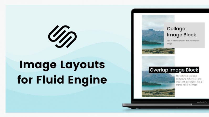
Image block layouts are still a part of classic editor page sections, blog posts, individual events, and additional product details in Squarespace. But if you are using the new Fluid Engine editor for a page section, you can recreate those same design layouts and this tutorial will teach you how!
—
Learn all about the new Fluid Engine editing experience in Squarespace at https://insidethesquare.co/fluid
—
If you are using version 7, or want to change a classic editor image block, check out this tutorial for some customization options.
For those of you using Fluid Engine, this tutorial will teach you how to create the same image block layouts we know and love using the new editing experience!
We’ll add images and text, and use background padding and more to create poster, card, overlay, and collage style images, buttons and all.
We’ll also take a look at the mobile version of Squarespace to change the layout and layers for smaller screens.
💸 GET 10% OFF YOUR FIRST YEAR OF SQUARESPACE 💸
Use my affiliate link and code PARTNER10 – You’ll save 10% off your first annual subscription & Squarespace will give me a little commission for sending you their way 😎
🔗 PARTNER10 → https://insidethesquare.co/partner10
– – –
🥰 SUPPORT MY CHANNEL → https://paypal.me/insidethesquare
💻 WEBSITE → https://insidethesquare.co
📧 NEWSLETTER → https://insidethesquare.co/email
🤳 INSTAGRAM → https://www.instagram.com/thinkinsidethesquare
👍 FACEBOOK → https://business.facebook.com/insidethesquare
📌 PINTEREST → https://www.pinterest.com/insidethesquare
– – –
The term “Squarespace” is a trademark of Squarespace, Inc. I am not affiliated with Squarespace, Inc. I just really love their platform.


