


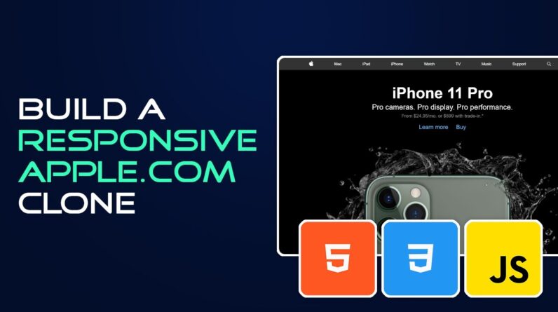
In today’s video we will create a partial replica of apple’s website using html and css which was redesigned for the launch of the new iPhone 11 pro. We will add several animations, including the use of keyframes, and we will also make the website responsive.
Don’t forget to leave a thumbs up if you found the video useful. Also, click on the bell icon to turn on notifications. This way you’ll be notified the moment new videos are uploaded.
Subscribe ► https://bit.ly/2Q3pCiB
[ PROJECT FILES ]
GitHub ► https://bit.ly/35gwFs2
SF font ► https://bit.ly/2HDGkx2
[ SOCIAL MEDIA ]
Instagram ► https://www.instagram.com/juliocodes
[ HOSTGATOR ]
Get affordable domain and web hosting with HostGator. Save up to 60% off of your entire purchase with the coupon code below.
HostGator ► https://bit.ly/2ZfR0u3
Coupon code ► JULIOCODES60
Video tutorial ► https://youtu.be/5B_LQqR0zsE
[ MY GEAR ]
Programming/Video editing laptop Specs & extras
Laptop: Dell XPS 15 7590
Processor: 9th Generation Intel Core i7-9750h
RAM: 32GB (Upgraded)
Graphics Card: Nvidia GeForce GTX 1650 4GB GDDR5
Storage: 500GB M. 2 PCIe NVMe SSD (Upgraded)
— Extras —
Monitor: Dell Ultrasharp 27″
Keyboard: Logitech MX Keys
Mouse: Logitech MX Master 3
Microphone: Blue Yeti
[ DISCLAIMER No. 1 ]
In order to speed up the development process CSS prefix are not used. In order to ensure cross browser compatibility please use prefixes where necessary.
[ DISCLAIMER No. 2 ]
This video description contain affiliate links, which means that if you click on one of the product links, I’ll receive a small commission. This helps support the channel and allows me to continue to make videos like this. Thank you for the support!