
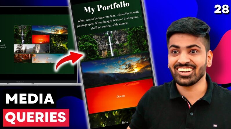
Hey guys, In this video, We will learn about Media Queries and how we can develop responsive websites using Media Queries.
Websites use:
Tailwind CSS Breakpoints: https://tailwindcss.com/docs/screens
📒 Get Notes here: https://telegram.me/realanujbhaiya/129
🧑🏻💻 Get Code here: https://telegram.me/realanujbhaiya/132
📌 Bookmark this Playlist: https://www.youtube.com/playlist?list=PLhzIaPMgkbxDxVcH-M-JFM73PY1R_i2mK
🥳 Join our Telegram Community:
Telegram channel: https://telegram.me/realanujbhaiya
🚀 Follow me on:
Instagram: https://www.instagram.com/Anuj.Kumar.Sharma
Linkedin: https://www.linkedin.com/in/sharma-kumar-anuj/
Twitter: https://twitter.com/anujbhaiya716
Hashtags:
#codingshuttle #webdevelopment