
Just getting started with Squarespace CSS? Awesome! 😍 I want to teach you the basics – grab my free Getting Started Guide here 👉 https://insidethesquare.co/learn
—
🥳 Ready to launch ? Use the code PARTNER10 for 10% off (affiliate code): https://insidethesquare.co/partner10
—
💕 Love this free Square space tutorial? You can donate via Paypal to help support my YouTube Channel https://www.paypal.com/paypalme/insidethesquare
—
This tutorial is for Squarespace 7.1 sites, not 7.0 sites like Brine or Bedford.
If you are using a Brine site, check out this tutorial for info on creating a split-screen layout on a single page: https://youtu.be/f7cLdU3nNXI
Aaaaaaand if you have no idea what that means, read up on what version you are using in this article because it makes a big difference in which codes will work for you! https://insidethesquare.co/theme-families
—
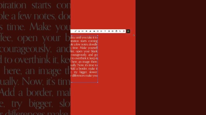
This tutorial will show you how to create a split section layout in a 7.1 Squarespace website. We are going to create one that is an image on one half and text on the other, another version with a solid color, and a third version that lets you scroll thru a big amount of text on one site, often called a split page layout. A few important things to note before you copy and paste this into your own site:
+ There is more than one way to do this! This is just one approach of many because code is super customizable.
+ The codes I am using in the tutorial, and pasting below, reset the split layout options on mobile because a split-screen on a small device can get a little too “squished”. If you want it to stay half screen, remove the line that starts with @media…
+ I want to encourage you to play around with the percentages and other values! I recommend using vh (view height) vw (view width) and percentage to keep it responsive, but try any value type you want.
→ Want to see this code in action?
Check out a live example with more info at http://insidethesquare.co/71split
→ Don’t know the section id?
You can replace the [data section id”=”123456789”] part of the code with #page to isolate just the sections on the page, not footer sections.
@media only screen and (min-width: 768px){
#page .section-background {
width:50%!important;
margin-left:50%!important}
→ Have a lot of content?
Use this code to create a vertical scroll, showing the image at full screen height but allowing the user to scroll through the content.
@media only screen and (min-width: 768px){
[data-section-id=”123456789”]
.section-background {width:50%!important;
margin-left:50%!important;
overflow-y:hidden
}
[data-section-id=”123456789”]
.content-wrapper
{margin-left:50%;
height:100vh;
top:5px !important
}
→ Want to learn more about Squarespace 7.1?
Check out my free course all about it at https://insidethesquare.co/training
—
▸▸▸ Ready for more?
The codes in this tutorial are just the beginning of all the cool things you can do with Custom CSS! When you’re ready to dive in and start customizing, you can use codes from my CSS Cheat Sheet. It has over 30 pages of code snippets and pro tips to help you get started. Download your copy at https://InsideTheSquare.co/css
▸▸▸ Ready to be an expert?
Copy & pasting CSS is a great way to get started, but if you really want to level up your skills and write your own code, then you’re ready for the Custom Code Academy. I created this course to teach you everything I know about CSS for Squarespace. Enrollment is open right now, and access lasts a lifetime. Join the academy today at https://CustomCodeAcademy.com
—
#squarespace #squarespacecss #howto #customizesquarespace #css #squarespacetricks #squarespacehacks
The term “Squarespace” is a trademark of Squarespace, Inc. I am not affiliated with Squarespace, Inc. I just really love their platform.