


Bootstrap 5 Crash Course Tutorial #7 – Grid Layout (part 1)
Learn how to use the grid system in Bootstrap 5 – using containers, rows, columns and responsive classes too. 🐱👤 View this course in full now – without ads –…
Read More »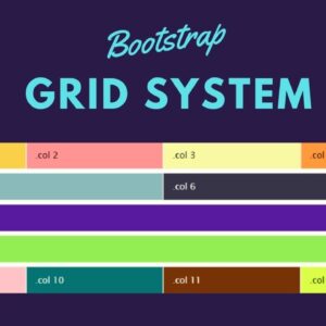
Bootstrap Grid System The Complete Guide – In Action
Bootstrap Grid System The Complete Guide – In Action In this lecture, we are going to learn how to create a bootstrap grid system. We are going to understand the…
Read More »
A New Web Design Trend Going Into 2024?
https://bit.ly/3sPJrxR 👈 Design & code like me. Use “UI2023” for 23% Off! https://designcourse.com/af 👈 My upcoming “Advanced Frontends” Course — Today, I’m going to show you a new emerging UI…
Read More »
Make a Responsive Web Design Grid in Illustrator
BrianWoodTraining.com—In this video tip, I’ll show you how to create a grid of guides for responsive web design in Illustrator CC.
Read More »