Edit Your Squarespace Site for Mobile
Spend wayyyy too much time trying to customize your client’s Squarespace website? 🧐 Save time and your sanity by avoiding these three TIME SAPPING mistakes that EVERYONE makes when finding…
Read More »
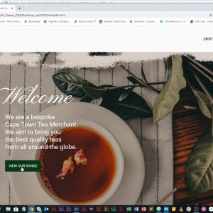
Bootstrap Website Building Part Four or Four — 04
Media Queries. In this fourth part of the Photoshop to Bootstrap Series we will cover how to create a more responsive site using media queries for the mobile version.
Read More »
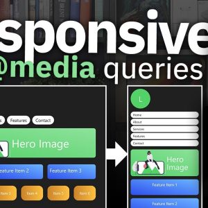
CSS Media Queries Tutorial for Responsive Design
Learn how to do CSS Media Queries with the latest techniques of calling @media, max-width, min-width to allow your HTML code to automatically adjust its responsive design. We take a…
Read More »
Responsive design made easy
Conquering Responsive Layouts: https://courses.kevinpowell.co/conquering-responsive-layouts Creating responsive sites can be a bit of a pain in the butt at times, but if you take it from a certain approach, you can…
Read More »
Creative Agency Website From Scratch | HTML & CSS
We will build a responsive website using HTML/CSS and look at things like positioning, flexbox, CSS Grid basics, and media queries Code & Images: https://github.com/bradtraversy/creative-agency-website Latest Udemy Courses: https://traversymedia.com 💖…
Read More »
Build A Responsive Website With HTML & CSS Tutorial
https://skl.sh/deved3 First 500 people to click the link will get 2 months of Skillshare for free! Disclaimer : This video is sponsored by Skillshare Check out my courses and become…
Read More »
Build a Responsive Website | HTML, CSS Grid, Flexbox & More
In this project we will build a custom website using HTML5 and modern CSS techniques such as CSS Grid, Flexbox, psuedo selectors, animation and more. We will also deploy to…
Read More »


