In today’s video, we run a competition between block themes and classic themes in WordPress.
👉 Block theme course https://www.pootlepress.com/wordpress-full-site-editing-course/
👉 One Day Sites : https://www.pootlepress.com/our-wordpress-training-courses/wordpress-xpress/
👉 🔥 Instant Websites 🔥 https://www.pootlepress.com/instant-websites/
👉 My WordPress Gutenberg plugins: https://www.pootlepress.com/wordpress-plugins/ 🔥
👉 My courses: https://www.pootlepress.com/our-wordpress-training-courses/
👉 Become a member of my club: https://clubpootle.com/
👉 Contact me at: jamie@pootlepress.com
👉 Sign up for my newsletter: https://www.pootlepress.com/sign-up-to-my-newsletter/
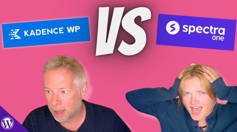
Specifically, I take a closer look at two popular themes: Kadence and Spectra One. As many of you may know, block themes have emerged as a new approach to customization, relying solely on blocks, while classic themes offer a more traditional way of customizing using the WordPress customizer.
Recently, I conducted a Twitter poll to gauge the community’s opinion on the functionality and ease of use of both theme types. The responses were quite intriguing.
Meg took on the challenge of performing various tasks using both the Kadence Classic theme and the Spectra One block theme. The tasks ranged from adding a site logo and changing the header background color to modifying the blog column layout and altering font styles.
Throughout the testing, we observed interesting differences in usability and complexity between the two themes. It became evident that block themes, like Spectra One, posed more challenges for a beginner, while classic themes, such as Kadence, offered a smoother and more straightforward experience out of the box.
However, I believe there’s a significant opportunity to improve the usability of block themes, allowing them to reach a wider audience and achieve mass adoption. In this video, I’ll be sharing the results of our user testing and discussing the implications of these findings.


