
Start creating responsive layouts with confidence with my free responsive layouts course: https://courses.kevinpowell.co/conquering-responsive-layouts
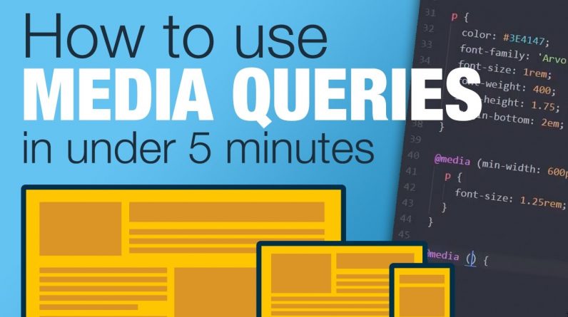
Quickly learn how to using CSS media queries. In this video, I explore what media queries are and how you can start using them right away.
If you know how to write your own CSS, you’ll be able to figure out media queries pretty quickly! All you need to do is assign new CSS rules at specific screen sizes.
This is just a brief introduction, but it should be enough to get started in the world of responsive web development.
If you’re after a little bit of extra reading about CSS Media Queries, here you go:
@media – CSS | MDN – https://developer.mozilla.org/en-US/docs/Web/CSS/@media
Using Media Queries – MDN – https://developer.mozilla.org/en-US/docs/Web/CSS/Media_Queries/Using_media_queries
CSS Media Queries & Using Available Space | CSS Tricks – https://css-tricks.com/css-media-queries/
—
New to Sass, or want to step up your game with it? I’ve got a course just for you: https://www.kevinpowell.co/learn-sass
—
I’m on some other places on the internet too!
If you’d like a behind the scenes and previews of what’s coming up on my YouTube channel, make sure to follow me on Instagram and Twitter.
Instagram: https://www.instagram.com/kevinpowell.co/
Twitter: https://twitter.com/KevinJPowell
Codepen: https://codepen.io/kevinpowell/
Github: https://github.com/kevin-powell/