30-second summary:
- Data storytelling is the process of combining graphics and narratives to help audiences understand complex data
- There are eight types of graphs and charts that marketers can use to tell data stories
- This guide will help you understand why data storytelling is important and what best practices you should follow
We’re seeing the growing importance of storytelling with data in 2021—primarily because of the amount of data being shared with audiences over the past year.
But data needs to make sense to people if it’s to lead to better engagement and increased conversions. That’s where visualization comes in.
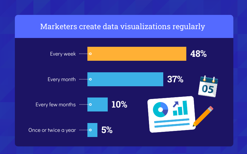
According to Venngage’s recent study, data storytelling has become a popular tool in an organization’s arsenal, with 48 percent of marketers creating data visualizations weekly.

Source: Venngage
In this article, we will share why businesses are turning to data storytelling to tell their brand stories and to capture the imagination of their customers.
Why is storytelling with data important?
Data-driven storytelling combines data and graphics to tell a compelling story. It also gives the data more context so audiences can understand it better.
The visual representation of data lies can show readers patterns and connections they may not have deduced on their own.
That’s what makes them such a necessary tool in a small business’ arsenal—data graphics can help businesses track their performance and set goals.
Kinds of data visualizations for storytelling
There are numerous visual tools available to render data—they highlight why data visualization is important.
Some of the kinds of data visualizations for storytelling include:
- Bar Graphs
- Bubble Charts
- Histograms
- Infographics
- Line Charts
- Maps
- Pie Charts
- Scatter Plots
Each visualization technique serves a purpose. Bar graphs and charts are ideal for creating comparisons, whereas line charts show linear relationships.
Maps show geographical data, like this example about the languages of the world.

Source
Pie charts share data according to set categories, while scatter plots show relationships between multiple variables.
To understand which charts and graphs to use to tell your data story, you can refer to the below infographic.

Source: Venngage
Five advantages of data storytelling
What advantages can businesses expect when storytelling through data?
These are the questions that marketers and designers ask themselves before undertaking such a design-heavy project.
But there are several uses for data graphics that make them worth investing time and effort into.
1. Provides deeper analysis into information
If you look at the types of visualizations described above, you can see how they provide greater insight into information.
A text post or report can do the same work but will require much more labor from the reader—increasing the chances of them leaving your page for shorter content.
A graphic, on the other hand, tells the reader the same information in a much shorter time. This improves engagement rates and conversions.
Visuals can also convey patterns easily allowing the reader to analyze information quickly by connecting the dots themselves.
2. Promotes problem-solving
Data stories are succinct materials that boost the problem-solving process and improve productivity.
This is because decision-makers don’t have to read reams of text or sift through information on their own—the graphics do the work for them and speed up problem-solving.
3. Engages internal and external audiences
Content marketing is geared toward engagement—and that’s why strong visuals that catch the eye are so important.
Visuals are more attractive than blocks of text—and data graphics that are well-made even more so than others.
This is because a data story is compelling in itself—numbers, percentages, relationships, and connections are all reasons for a reader to stop what they’re doing and look at your graphic.
As a result, you increase traffic and views to your content and your website, all while promoting a favorable impression of your brand.
4. Improves reporting abilities
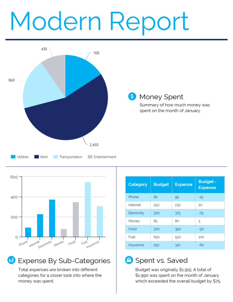
Reports are part and parcel of business life. A great data story is key to a memorable and powerful analysis, like this simple but elegant finance infographic template.

Source: Venngage
There is so much data involved in creating reports—if they are articulated through numbers and tables, your audience will be lost, and worse, bored.
That is why great data storytelling is so important in report-making, not just to keep people interested but to tell a good story.
5. Wide reach
Graphics can be repurposed in multiple ways and for a variety of channels. Social media platforms like Twitter, which are chockful of information, require a strong visual to get attention.
That attention can be generated through data storytelling. Bite-sized visuals arrest the viewer as they’re scrolling through their feed—they’re also easy to absorb and more shareable.
Visualized data makes for great content whether for social channels, newsletters, blog posts, or website landing pages.
A great graphic has the potential to go viral, widening the reach of your content and influence.
Data storytelling best practices
Paying heed to the importance of visualizing data means following a few best practices. You can’t create visuals without having a goal.
You also need to understand the subject matter and the needs of your audience so your data tells the story you want it to and engages your readers.
Here are the six best practices for creating visualizations that will boost customer retention.
Create visual hierarchies
Hierarchies are necessary for people to read and interpret your data. Visual hierarchies are a key component of data storytelling because they help readers create context and patterns.
Since you don’t want to write too much text to explain your graphic, hierarchies are the best way to convey context. Here are the best ways to build visual hierarchies and context:
- Placement of elements from top to bottom
- Grouped elements
- Varying colors
- Varied visual styles
- Increasing font sizes
Users will be able to deduce the relationship between data and elements using the above methods.
Build trust into data visuals
The benefits of visualization are completely lost if you can’t elicit trust in the people viewing your information.
When we put statistics together for studies at Venngage, we survey hundreds, if not thousands, of respondents before beginning the design process.
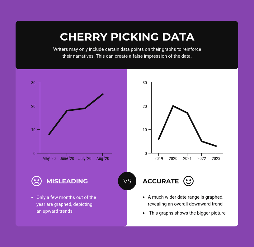
This is necessary to avoid cherry-picking data, which can be misleading, as this graph shows, and accidentally designing bad infographics.

Source: Venngage
It is always best to compile data from trusted sources that are unbiased. Verify that data with at least two other sources so you know that the data is representative of the information.
Only then should you move into the design phase. When creating your visuals, avoid distortion as much as possible by following these methods:
- Choose charts and graphs that suit your data
- Your visual should include a scale to give context to the data
- Baselines for data should always start at zero
- Both axes should appear in the graphic and be equal in size
- Use all relevant data in the visual; don’t leave important data out
Size plays a major factor in trust-building—use similar-sized visual elements, like icons, that can be scaled on a graph.
Show changes in data through size and space but both should be equal between all visual elements.
Keep visualizations simple
Pulling together data requires a great deal of time and effort. It can be tempting to design visuals that express as much information as possible.
But that mindset can negate the effectiveness of visually representing data, and overwhelm your audience.
Visualizations should be simple and easy to understand—not only is this a brand design trend in 2021, but it keeps readers more engaged, like this chart we created.

Source: Venngage
While a complex visualization may look sophisticated and interesting, if your audience spends too much time trying to understand it, they’re going to eventually give up and move on.
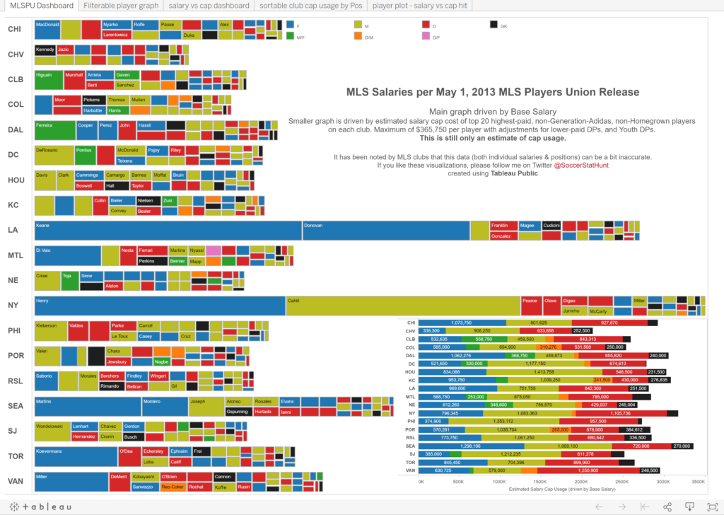
A badly-designed graphic, like the one below, will also give readers a negative impression of your brand and product, losing you more potential customers.

Source
Data graphics should be simple enough to understand at a glance—that’s all the time you have to get users’ attention.
Don’t overuse text
If your data story needs more text to understand it, the visual isn’t well-designed. While there needs to be some text in the graphic, it shouldn’t dominate the image.
You can always write a blog or social media post around your findings, but your readers shouldn’t be lost without the context.
The benefits of data-driven storytelling lie in the fact that your information can be communicated through the visual medium.
If you’re relying on text to do all the talking, your graphic is lacking. Use graphic elements like icons and shapes, and break your data down into bite-sized portions so it’s easy to convey.
Use colors wisely in visualizations
Colors have a lot to do with the importance of data visualization storytelling—they can be used to highlight key information in a graphic and augment the data story you are trying to tell.
But that doesn’t mean you use all the colors in the palette in your graphic. Again, too many colors, like too much information, can overwhelm the audience.
On the flip side, by using too few colors, you can mistakenly create connections between data that aren’t correct.
Use your brand colors in your visualizations, and augment them with two or three colors. Try not to exceed five colors or five hues of a single color.
If you’re wondering what kinds of colors work together, you can use this list to choose color combinations.
Use muted colors in your graphics, instead of bold ones, as that is what is on-trend at the moment and will make your visuals more relevant to audiences.
Highlight data in visuals
As much as you want users to understand the data as you present it to them in a visual, you aim to capture their attention as quickly as possible.
Even the simplest visuals need some highlights to draw the eye and it’s a great way to maintain the integrity of your data story.
Use a highlight color to make relevant data stand out or increase the font size or icon size to do the same.
By spotlighting the most important information, you will be more successful in attracting attention to your visual and telling your data story.
Businesses can leverage the importance of data storytelling
We’ve highlighted how data storytelling can make a difference in business growth in 2021.
Graphics share insights and correlations that audiences may have overlooked, while still being compelling tools that engage and convert customers.
Ronita Mohan is a content marketer at the online infographic and design platform, Venngage. Ronita regularly writes about marketing, design, and small businesses.
The post Unlocking the secrets of data storytelling in 2021 appeared first on Search Engine Watch.


