Visit my STORE: https://bit.ly/mavi-design-store
Explore Mavi Design PREMIUM Assets: https://bit.ly/mavi-design-premium-assets
Download FIGMA for FREE: https://bit.ly/get-started-with-figma
Take FULL advantage of ALL FIGMA’s features: https://bit.ly/figma-professional-plan
FREE FIGMA COURSE / SERIES: Design a Website in Figma: https://youtube.com/playlist?list=PLCUPtxXqnWn0AMIjZmNdkrzWVjLHOW2NT
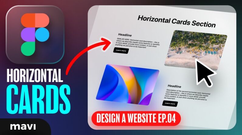
In the fourth episode of “Designing a Website in Figma”, we’re going to create the horizontal cards (image text zig-zag) section for our website. The usual headline + description + button on one side and image on the other side. We will be using components, instances, component properties (both boolean, text and nested instances) and auto layout to create a component that we can reuse across our website ux / ui to maintain consistency.
P.S.: If you’re about to write a comment saying I forgot to use H3 instead of H2 on card names, great catch! I’m going to correct that in the next episode:)
How to design a website in figma: image and text autolayout – horizontal feature cards ux ui design – design a website from scratch in figma – FREE full course
#figma #webdesign #autolayout #freecourse #figmatutorial
————————
© 2023 Mavi Design


