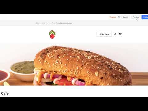
Get an overview of the main navigation tools of the Square Online website builder. This tutorial shows you how to:
– Make changes to your site’s main banner
– Add an online ordering page
– Add an Instagram section
– Add your location info
– Add a featured events section
Learn more about Square Online at: https://squareup.com/ie/en/online-store
——-
Running a food and beverage business can mean you’re a little short on time. But don’t worry, with Square Online you can get started quickly so that you can get back to focusing on your business.
Today we’re going to run through the main navigation of the new online store builder.
There are three main areas to your builder:
– On the left is your edit panel.
– Then to the right you have a preview of how the site looks and you can also make edits to your text.
– At the top you have the toolbar that lets you switch between mobile and desktop view and add entirely new sections, pages, items and categories.
Okay as an example, let’s see how easy it is to change the top area of your page, or what we call the main banner. Simply click on the section you want to edit and you’ll see the panel on the left dynamically changes for you.
I can go up to customize and choose from a range of pre-designed formats. I like this one.
Now let’s try to add an online ordering section. I just add a section and select the featured menu items section. From here I can add and edit my menu items which customers can order online for delivery or collection at my restaurant.
Next let’s add a section. Sections are blocks of content layouts that you can add and customise. I just go to the page sections and then hit add section. Now I can choose the flexible layout that I need.
Let’s add an Instagram feed section. Here on the left I can already see that my Instagram account is already linked, but you can do this at any time by hitting manage. I can make loads of customisations, like making sure my title is visible, adjusting the colours, spacing and sizing.
If I go back to my page sections, I can even reorder it up or down the page. Now let’s add a location so customers know exactly where to find us. I simply go to add section and find the location and hours layout.
On the right-hand side I can adjust any text I need and to add collect and eat in locations, I just go to the left and hit add or edit location details. This will take me to a new tab. I just fill in the details and the map will auto update with my listed location.
Now if you’re running pop up events, you can easily add a section for that too. Just go down to the featured events section and add it. I already have mine set up, but everything is customisable, from the titles to the images you use to the time and date so your online customers know everything they need.
Square Online makes it easy for you to have a professional-looking site with flexible layouts you can control. You can go live in seconds with publish, but if something isn’t quite right, no problem. You can just select undo.
You can also hit preview to view your changes before you publish. Use it a few times and it’s a piece of cake.
And that’s an overview of your Square Online builder.
——-
Get started with Square → https://squareup.com/signup
Square on Facebook: https://www.facebook.com/squareireland/
Square on Instagram: https://www.instagram.com/squareireland/
Square on Twitter: https://twitter.com/squareireland


