


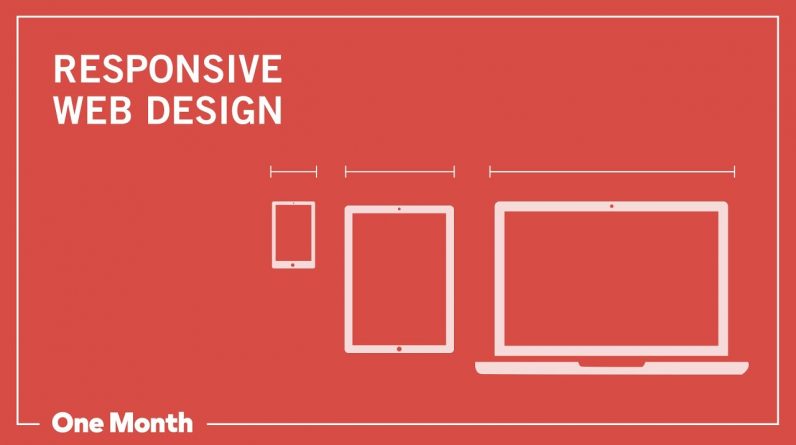
Responsive design means writing code ONCE, and having the page look great EVERYWHERE. A great, responsive site should be able to adapt to various screen resolutions. It will look good on a desktop computer, iPhone, iPad, or any of the other devices that people carry around in their pockets.
There are four types of responsive design: responsive, adaptive, fluid, and fixed. Each of them fall under the broader category of being “responsive,” yet each has it’s own pros and cons.
How to tell is a website is responsive? One way to test if your site or any site is responsive is just by opening it up in the browser and then doing this, making it smaller. This way you can see if the website looks good at the various widths and sizes.
Check out some responsive design examples:
https://learn.onemonth.com/what-is-responsive-design/
Learn how to make responsive websites, using a mobile first approach to media queries and popular frameworks like Bootstrap.
https://onemonth.com/learn/responsive-web-design
STAY TUNED:
One Month ► https://www.onemonth.com/
YouTube ► https://youtube.com/c/onemonth
Facebook ►https://www.facebook.com/OneMonthEdu/
Twitter ►https://twitter.com/onemonthedu