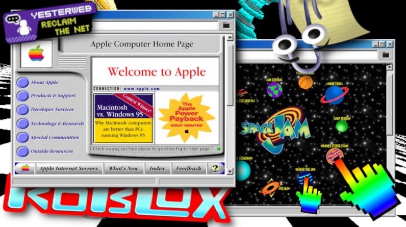
Ever notice how boring websites look nowadays? They all seem to be largely the same – mostly flat rectangles with pictures in them, plain-looking text, and bland, solid colored backgrounds. But take a trip back to the late 90’s/early 2000’s, and you’ll see that the Internet was a much different looking place. Bright colors/patterns, creativity, and chaos abound; no one was following any rules and it seemed like the main goal was simply to make the craziest looking website possible. In the modern era, some feel disgusted with Web 2.0’s emphasis on engagement and advertisement, and nostalgic toward this older version of the Internet. Join me in exploring this unhinged era of web design, and the modern-day movement that it’s sparked nearly 2 decades later – Yesterweb.
PATREON: https://www.patreon.com/Nitrolord
DISCORD: https://discord.gg/qHykbqeqmw
TWITTER: twitter.com/NCrystal81
ROBLOX: https://www.roblox.com/users/163367419/profile
Sources: https://docs.google.com/document/d/1OgEIMvk50ApWEsy38kx8z9_2dRz_ZuTKRKQhz_QRtQ0/edit?usp=sharing
If you like Roblox, Classic Roblox, Websites, Nostalgia, Web 1.0, Toastedcherries, Izzzyzzz, Polygon Donut, Vaporwave, Retrowave, Retro, Weirdcore, Kidcore, Windows XP, Kwite, Summoning Salt, Commentary, Gaming, Builderman, Minecraft, VR, Video Essays, hbomberguy, Sarah Z, Strange Aeons, Aesthetic, Nintendo, Pepsi, Mcdonalds, Hot Topic, Shrek, Geocities, Neocities, Hot Wheels, Toys R Us, Building, Scripting, HTML, Web Development, Internet, Web Dev, CSS, Computers, Windows 95, Netscape, AOL, Firefox, and more, you’ll probably like this video. Not sure why you read all of this sentence, as it’s only here for SEO purposes, but I respect you for doing it. 🙂
Apollyonic says “hai :3”


