Online shops rarely sell just a few products. If your shop has a few hundred or a thousand articles, it might help if you offer your customers a filtering option. You must do whatever you can to help your customer get to the desired product as soon as possible. Ecommerce filters can help you solve this problem.
Table of contents
- Why should you use product filters in your online store?
- How do people browse your online store?
- How to use eCommerce filters
- Examples of eCommerce filters for products
- Amazon.com
- Nike.com
- Wayfair.com
- BHPhotoVideo.com
- Risks of having filters on your products
- In conclusion
Why should you use product filters in your online store?
Ecommerce filters and faceted navigation help you break down long lists of products into manageable results. If you implement them correctly, your clients will thank you with a higher conversion rate. But, only if you think these through. To achieve that, you must first make sure to tag your products properly and develop an accurate filter system.
As online stores grow and get more sophisticated, new ways of guiding customers need to be added. A simple product filter might not be enough. In these cases, faceted navigation can help. Faceted navigation looks kind of like a filter system, but it incorporates many more aspects — or facets — to help users find what they are looking for. These facets can be generated on the fly and might differ for different products. There are plenty of options for WooCommerce or Shopify store to set this up.
These kinds of filters do come with a warning, though. If developed and implemented incorrectly, they could harm your SEO. You do not want your CMS to generate new URLs for every search query automatically. Tread carefully. We’ll dive deeper into this later on in this post.
How do people browse your online store?
Think about how people search your shop; do they drill down into the specs, or are they more like seasonal shoppers looking for a new coat for autumn? The kind of filters you choose depends on the shop you run and the products you sell. Electronics have lots of specifications that you can place in a filter. A shop that sells handmade scarfs can use filters for the material used or what kind of style it is (urban, chic, outdoor, to name a few).
Flawless UX and usability are essential for SEO. If you make your site function without fault, and your visitors can easily find what they want in your shop, you’ll get lower bounce rates and higher conversion rates. These are all signs for Google that your site works like it should and could result in higher rankings.
How to use eCommerce filters
A well-thought-out filter system can save the consumer an enormous amount of time and frustration. Sometimes, however, filters haven’t been properly developed. Think about all the shops where they implemented a site-wide filter. Don’t do this. That might be ok if you have just a few products in similar categories, but not if you’re aiming to be Amazon. Think about that for a moment: how would you ever find anything on Amazon if it wasn’t for that excellent filter system?
So, you have to have category-specific filters. Place these front and center on your category pages. People shouldn’t miss this, because if they didn’t find them, these filters don’t exist. In addition to that, if you only use site-wide eCommerce filters, some filter options won’t fit the category a customer is browsing. Filtering for a white, 24-megapixel point-and-shoot camera doesn’t make sense when you’re on the DSLR category page and want to select the best DSLR cameras under $500.
Examples of eCommerce filters for products
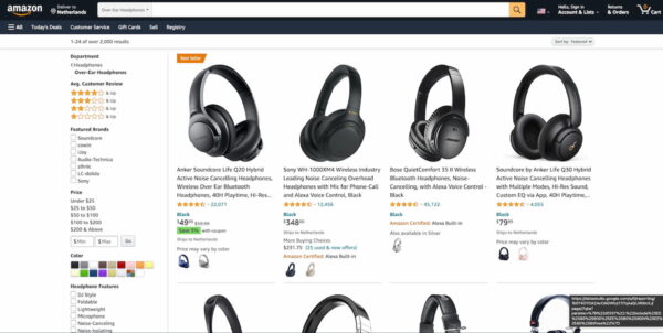
If you want to see how filtering ought to be done, you have to study Amazon. This eCommerce behemoth tries to help customers find what they want in as little time as possible by using faceted navigation. Let’s say you are looking for over-ear headphones, that have good reviews from buyers.
Amazon.com
On this page, you can select which type of headphones you are looking for, and Amazon instantly presents you with a list of suggestions. You can narrow it down further by filtering on price, features, or wireless type. By doing this, Amazon has done a lot of hard work for the customer. In a couple of seconds, you have a manageable list of headphones to go through.
Nike.com
Do you need new sportswear? Something to help you stay dry during your morning run, has a tight fit and is available in size M? You can find some tights using the thematic filter on Nike.com, see:
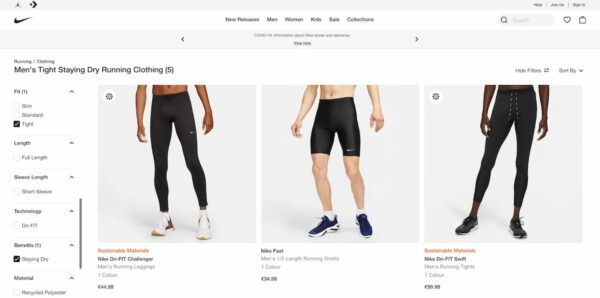
Nike.com lets you easily filter types of products based on actual questions customers have. Choose the product category, then the sports, what you want it to do (keep you warm, cool, visible, et cetera), then a fit, a color, and size. In the end, you’ll be presented with just a couple of products that match your specific filters.
Wayfair.com
Looking for a new couch can be one of the most frustrating experiences ever. It’s something you don’t buy every month, plus it will last quite a while, so you have to be sure of your decision. It can take some time to find the perfect couch. Wayfair helps customers filter their enormous couch selection with an impressive filter system.
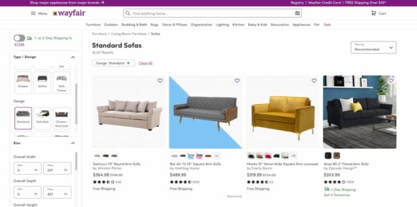
Wayfair.com must be the king of filtering since they use every filter type known to humanity but still keep it manageable. In the couch section, you can filter on the popular options, but also handy ones like style, print, back style, application, frame finish, et cetera. It’s a massive array of filters that lets you narrow down the search results to specific products that match your specifications perfectly.
The flip side of offering all these filters is that you have to make sure they are usable. Don’t present a list that never ends. If you have loads of options in a filter section, please truncate these. Mayfair also uses a big + button to hide sections you don’t need. Another option is to make a list scrollable, although it’s probably better to truncate. Test whatever works for you.
On a side note, Wayfair has another way of keeping customers sane. Check out the Pinterest-like board feature where customers can save their selected couches and compare them later on. This makes it so much easier for clients to patiently shop on the site, without having to think about what that one couch was they’d like so much. Simply click the heart icon!
BHPhotoVideo.com
Ever went shopping for a camera bag only to find out the one you bought doesn’t fit? Well, you’ve probably drowned in a sea of bags and picked the first one that could have fit based on the size specifications. We’ve all been there. If you want to help your customers, you should offer a compatibility filter.
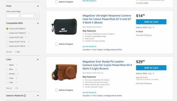
On B&H you’ll find your camera bag in a jiffy. Select the dedicated camera bag category, find your brand, add some specs and away you go. You can even search the results if you want. How cool is that?
Risks of having filters on your products
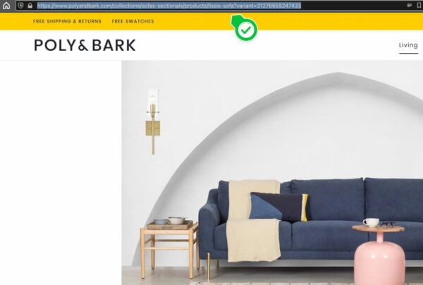
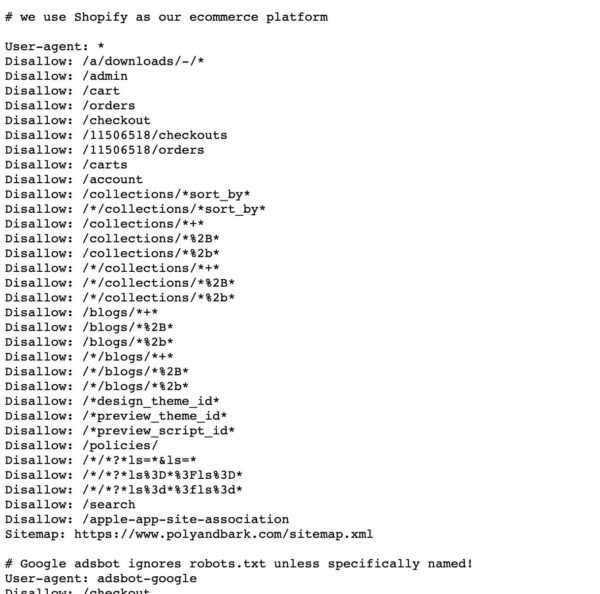
Having faceted navigation on your online store can cause some issues. Most importantly, duplicate content issues. With every filter action, the system can make a new URL containing the filters as properties appended to the slug. These can multiply pretty quickly and, if they are not handled correctly, might lead to thousands of similar URLs. This, in turn, might confuse search engines as to what to show.
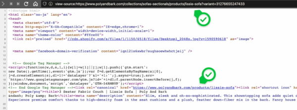
To counter this, you must prevent your site from indexing these URLs and only index the main URL. So, if you have a t-shirt in different sizes and colors, there’s no need to have all those different URLs indexed — only the main product URL should be indexed. You must also make sure that your canonical URLs point from the faceted URL to the proper destination.
Faceted navigation can also lead to a less optimal crawl budget — as Google has to crawl many more URLs than necessary — and even spider traps! Read more on how to handle this in Google’s large site owner’s guide to managing crawl budget.
In conclusion
Filtering and faceted navigations help your customers find what they want and find it quickly. However, only if you’ve thought long and hard about how to present your filtering options. There are lots of ways to go about this, and you have to pick the ones that fit best your online shop.
Whatever you do, make sure the filters are visible and logical. Hidden filters stay hidden for visitors. Don’t miss this great opportunity to get them to their products fast. It’s a great service to your customers.
Do think about the technical implications, though. Incorrect use of the technology behind filters could make the CMS generate new URLs for every search and that’s something you absolutely do not want. The implications for your SEO could be great.
Read more: eCommerce usability: the ultimate guide »
The post Easier online shopping with eCommerce filters for products appeared first on Yoast.


