

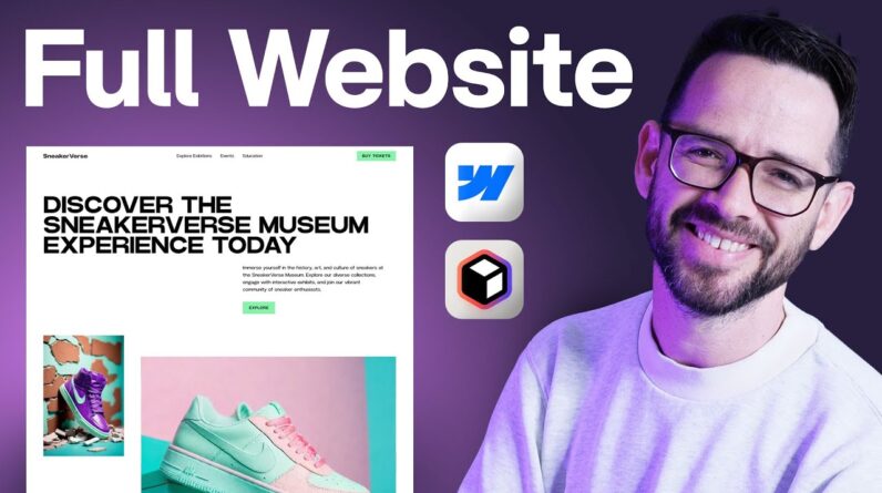
Mobile-first responsive web design in 2021 🔥
In this video, we are going to see how we can build a website using a mobile-first approach.
We will be building a responsive website using these technics.
We will be using media queries to make the page responsive for different screen sizes.
⭐ Kite is a free AI-powered coding assistant that will help you code faster and smarter. The Kite plugin integrates with all the top editors and IDEs to give you smart completions and documentation while you’re typing. I’ve started using Kite and I love it!
Source code: https://github.com/codersgyan/mobile-first-web-design
NodeJs crash course: https://youtu.be/wdBCoRMMxto
Tailwind CSS crash course: https://youtu.be/91evwKVzGRE
Realtime pizza app using Node Js: https://www.youtube.com/playlist?list=PLXQpH_kZIxTVRmXQN9J0Az76te5mAreLV
Flexbox: https://youtu.be/7WE_K7NDL0s
You may connect with me:
Facebook – ✅ https://www.facebook.com/codersgyan
Discord – ✅ https://discord.gg/WPfWD3B
Telegram – ✅ https://t.me/joinchat/AAAAAFbBD_inny1ksCzOvA
Instagram – ✅ https://www.instagram.com/codersgyan
Twitter – ✅ https://twitter.com/CodersGyan
You may support this channel by becoming a patron 🙂
✅ https://www.patreon.com/codersgyan
Music used in this video:
Rock Angel by Joakim Karud https://soundcloud.com/joakimkarud
Timestamps :-
0:00:00 – Intro
0:01:55 – Project setup
0:11:18 – Navbar
0:42:30 – Hero section
1:07:45 – Css Grid
1:26:48 – Media queries
1:50:33 – Conclusion
#mobilefirstdesign #responsivewebdesign #html #css #javascript #mediaqueries