

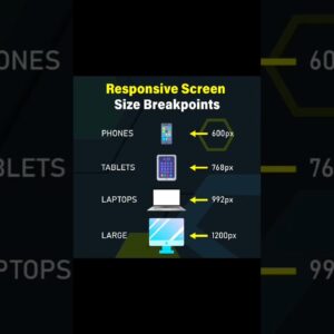
Responsive Screen Size Breakpoints | Mastering CSS Media Queries for Responsive Web Design | CSS
Responsive Screen Size Breakpoints | Mastering CSS Media Queries for Responsive Web Design | CSS Learn how to create responsive web designs by mastering the concept of screen size breakpoints…
Read More »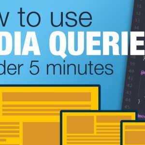
Tutorial: Learn how to use CSS Media Queries in less than 5 minutes
Start creating responsive layouts with confidence with my free responsive layouts course: https://courses.kevinpowell.co/conquering-responsive-layouts Quickly learn how to using CSS media queries. In this video, I explore what media queries are…
Read More »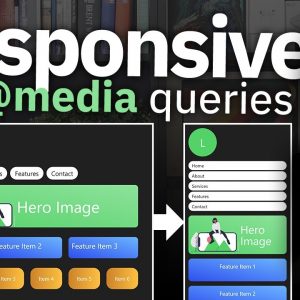
CSS Media Queries Tutorial for Responsive Design
Learn how to do CSS Media Queries with the latest techniques of calling @media, max-width, min-width to allow your HTML code to automatically adjust its responsive design. We take a…
Read More »